Working with four potential end-users, the study identified five categories of features that support well-being through the transition into retirement, with personalization running through all of them, most notably two AI-powered chatbots. Evaluating the prototype with participants surfaced insights into acceptance and effects and shaped a more user-friendly design. Screenshots are in German, as the study was conducted in Austria.
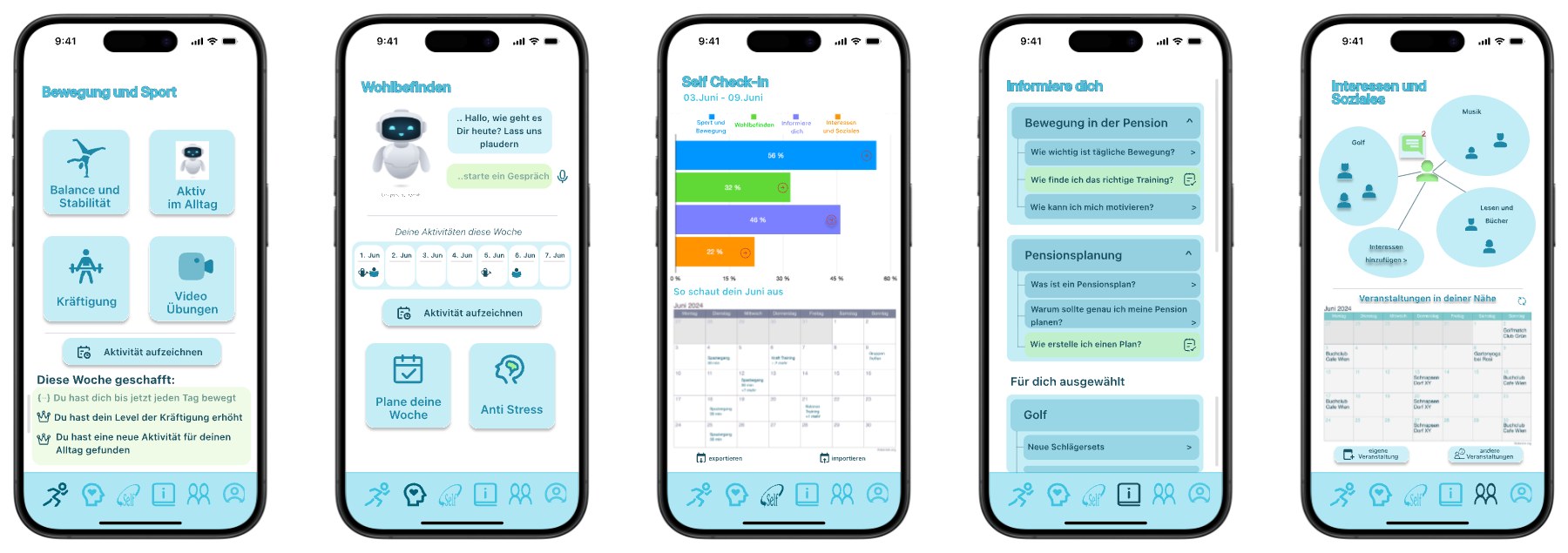
Overview of the RetirementBuddy concept and core app pillars.
The Problem
Retirement is double-edged: it brings freedom and less stress, but the loss of daily structure, financial uncertainty, and separating from a lifelong work identity can undermine well-being just as easily. Existing digital health tools rarely account for that duality, or for the accessibility and emotional needs of older adults, even though a well-designed mobile app is well placed to support retirees through the transition.
The Solution
RetirementBuddy is a mobile app built with a User-Centered Design (UCD) approach. An AI-powered chatbot provides emotional support, daily activity suggestions, and personalized monitoring without the cognitive overload of traditional apps.
Two-Iteration User-Centered Design (UCD) Approach
Designing a healthy-aging app for retirees meant balancing AI capabilities against strict accessibility standards, so I structured the project around a two-iteration UCD process.
- Literature review & survey: mapped the psychological impact of the retirement transition from existing literature, then ran a wide online survey to check those claims against the mindset of soon-to-be retirees.
- Feature draft & static mockup: turned those insights into the first feature draft (IT1) and a static mockup of the core concepts and product pillars.
- First evaluative interviews: individual feedback sessions with four end-users on the static mockup, surfacing their expectations and pain points.
- Refinement & interactive prototype: reworked the feature draft from IT1 findings and upgraded the static screens into a high-fidelity clickable prototype, applying accessibility guidelines for older users: high contrast, legible type, large tap targets.
- Second evaluative interviews: a second round with the same four participants on the clickable prototype, measuring how well the iterations resolved the IT1 issues.
- Feedback synthesis: thematic analysis of the session notes, clustering recurring behavioral patterns and emotional responses around trust and friction.
- Final output: a definitive feature and requirement list plus the finalized full-scope interactive mockup.
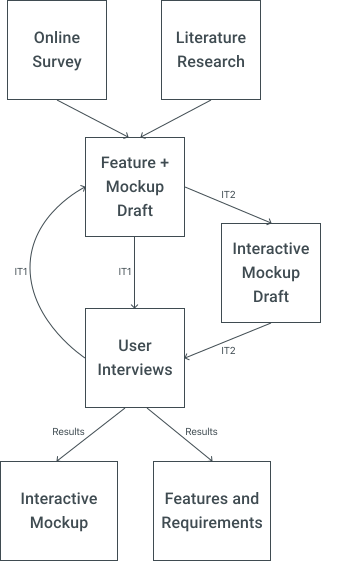
Two-iteration user-centered design process, from discovery to final prototype.
Redesign Example from IT1 to IT2
The first round of interviews showed that a category built purely around connecting and messaging other users, "Vernetze dich", didn't find the expected demand. In response, its focus shifted from connecting toward general interests, and the category was renamed "Interessen & Soziales" to reflect its new purpose. Private and group chats remained available, but were no longer the centerpiece.
In IT2, profiles additionally show an approximate location, such as "close to Vienna", and users can enter their own interests and hobbies, which feed into the personalized suggestions elsewhere in the app. They can also add events they are hosting or know about to a public calendar, which are then suggested to other users who share the same interests.
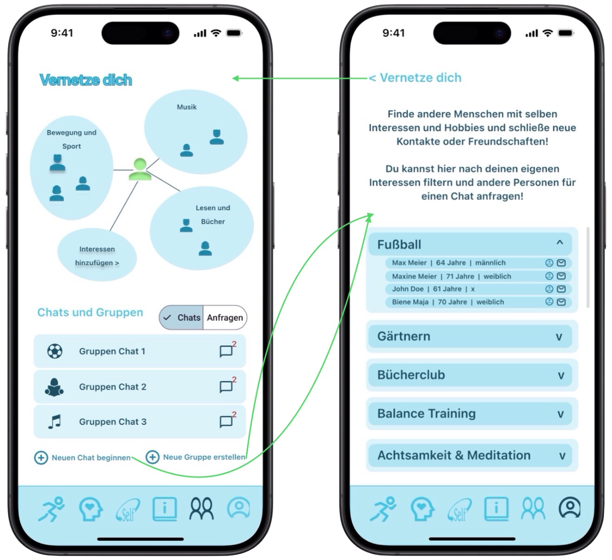
IT1 — "Vernetze dich", centered on connecting and chats.
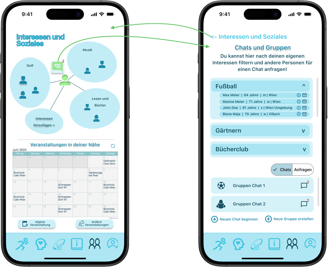
IT2 — "Interessen & Soziales", centered on shared interests and events.
Key Features & Design Solutions
The final prototype is organized into five categories spanning emotional well-being, physical activity, information and education, and interests and social life.
- Conceptual AI companion: embedded in the well-being categories, offering tailored suggestions for maintaining well-being and working movement into daily life.
- Personalization & habit building: features adapt to user inputs and preferences, with goal reviews and achievements to encourage consistent habits.
- Senior-friendly UI: high contrast, clear typography, and straightforward navigation to keep cognitive load low and the app approachable rather than intimidating.
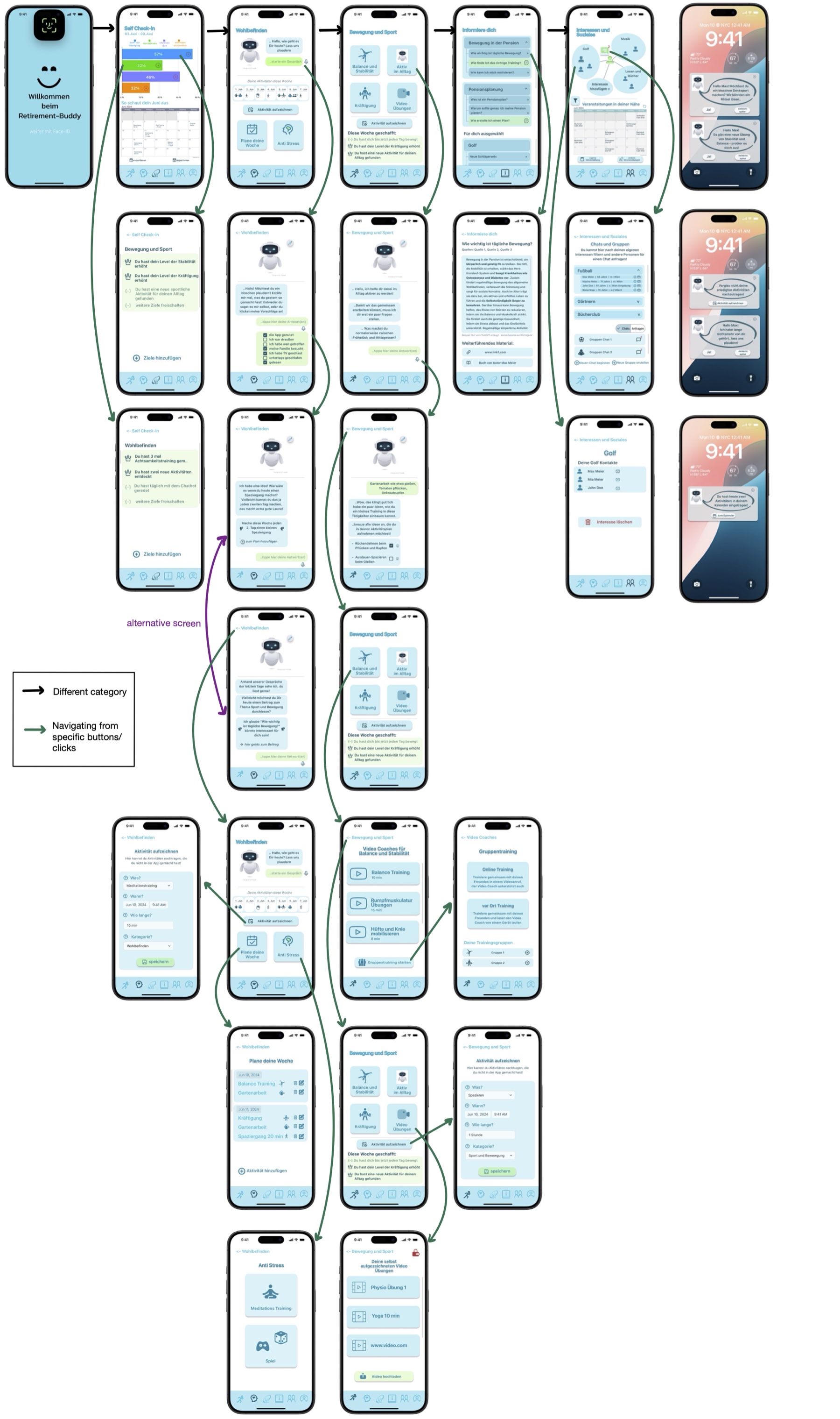
Full-scope interactive mockup following the second design iteration.
Outcomes & Next Steps
A preliminary evaluation showed that while most retirees are content, those who struggle with the transition are a vital user base for digital interventions. Synthesizing the interviews surfaced clear themes around feature acceptance, physical activity, and trust.
- Physical activity came first: participants consistently named physical activity as the most critical factor in healthy aging, validating the app's focus on movement and progress visualization.
- Receptive to digital support: users responded positively to the five categories and the multidimensional approach, with strong willingness to use the app.
- AI interest vs. privacy friction: users valued the AI chatbot's tailored suggestions but had clear data-privacy hesitations; transparent security communication is a prerequisite for acceptance.
- Designing for trust: transparent onboarding and UI that clearly explains data protection, to address concerns about AI data usage.
- Health expert endorsements: partnerships with medical professionals to build trust, and to help train the chatbots for more reliable mental and physical health guidance.
- ML for mood detection: scope the technical requirements for real-time emotion detection, moving the personalized feedback loops from static concept to functional feature.
What I Learned
- Learning #1
One user group, very different opinions
Test users from the same group thought very differently. The design has to stay simple while being flexible enough for many needs, which is why personalization matters so much in wellbeing apps: it adapts even to users who are a special case.
- Learning #2
Trust comes first in AI features
Always explain what is behind an AI feature and how data is used, and never make users feel they have to use it.
- Learning #3
Users reveal what is actually needed
A feature that theory and studies said was needed can still fail with test users. Research gives a starting point, but testing shows what has to change.
© 2026 Victoria Zeillinger · Impressum