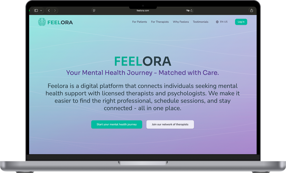
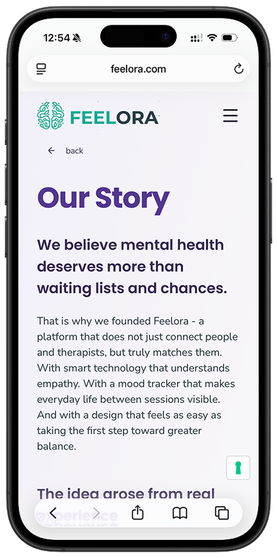
Feelora's landing page, shown on desktop and mobile.
Context and Scope
Feelora was a mental health platform that used AI-based matching to connect patients with a therapist who fits, cutting wait times from months to as little as three days. As Co-Founder, Sole Product Designer and UX Researcher, I designed every screen of the product and built its entire frontend: the landing page and a web app with two sides, one for patients and one for therapists.
The MVP was fully functional and connected to the backend, and we ran a pilot with three therapists and three patients. After the pilot we paused the project: before a real launch, a health platform needs full GDPR and medical device (MDR) compliance checks, and as a pre-seed team we couldn't fund that legal work. All screenshots below show the live product with dummy data.
The Challenge: A Bottlenecked System
While 39% of Austrians struggle with mental illness, the system creates friction on both sides. Research and market analysis pointed to four recurring problems:
- Long waits: patients wait months for structured psychological help.
- No personalization: generic therapist directories turn the search into trial-and-error that wastes scarce appointment slots and delays progress.
- System overload: frequent patient–therapist mismatches add inefficiency to an already overstretched system.
- No continuity: patients have no structured way to track progress between sessions.
The Solution: One Platform, Two Apps
Feelora connects both sides of therapy. Patients get matched and supported between sessions; therapists get matched patients and the context they need to prepare. Both apps share one design system and one codebase.
- Onboarding questionnaire & AI matching
- Chat with their therapist
- Mood tracker they choose to share
- Appointment booking & homework
- Onboarding questionnaire & license verification
- Patient overview & chat
- Mood insights to prepare sessions
- Calendar, availability & homework
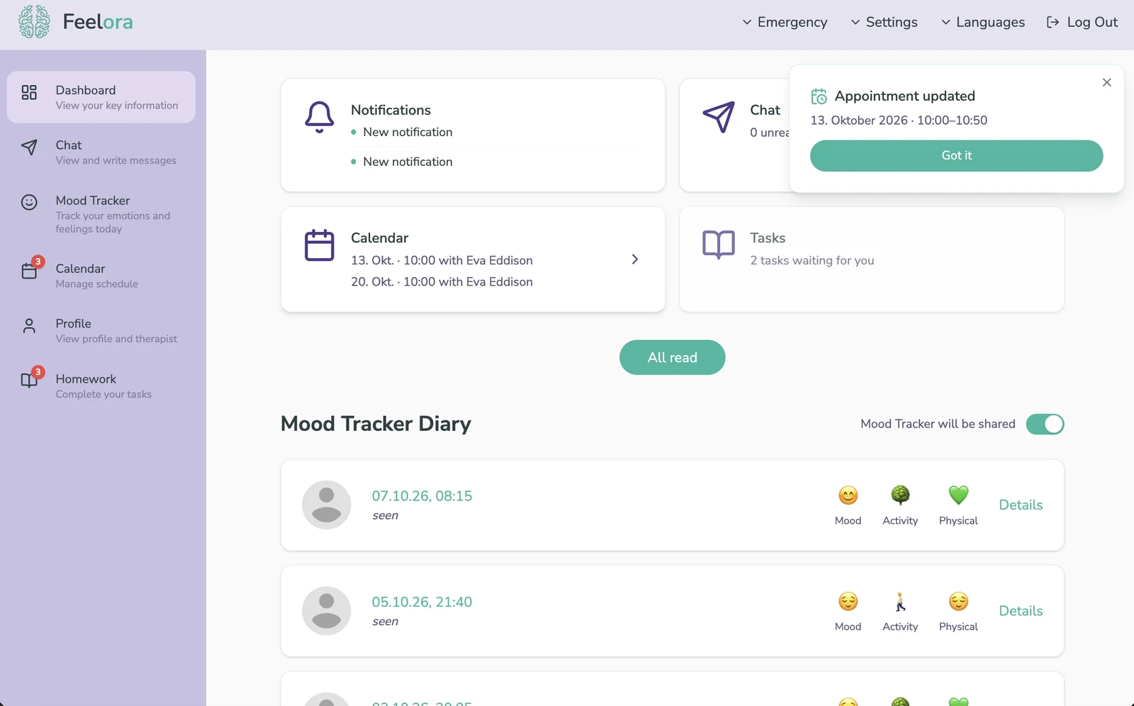
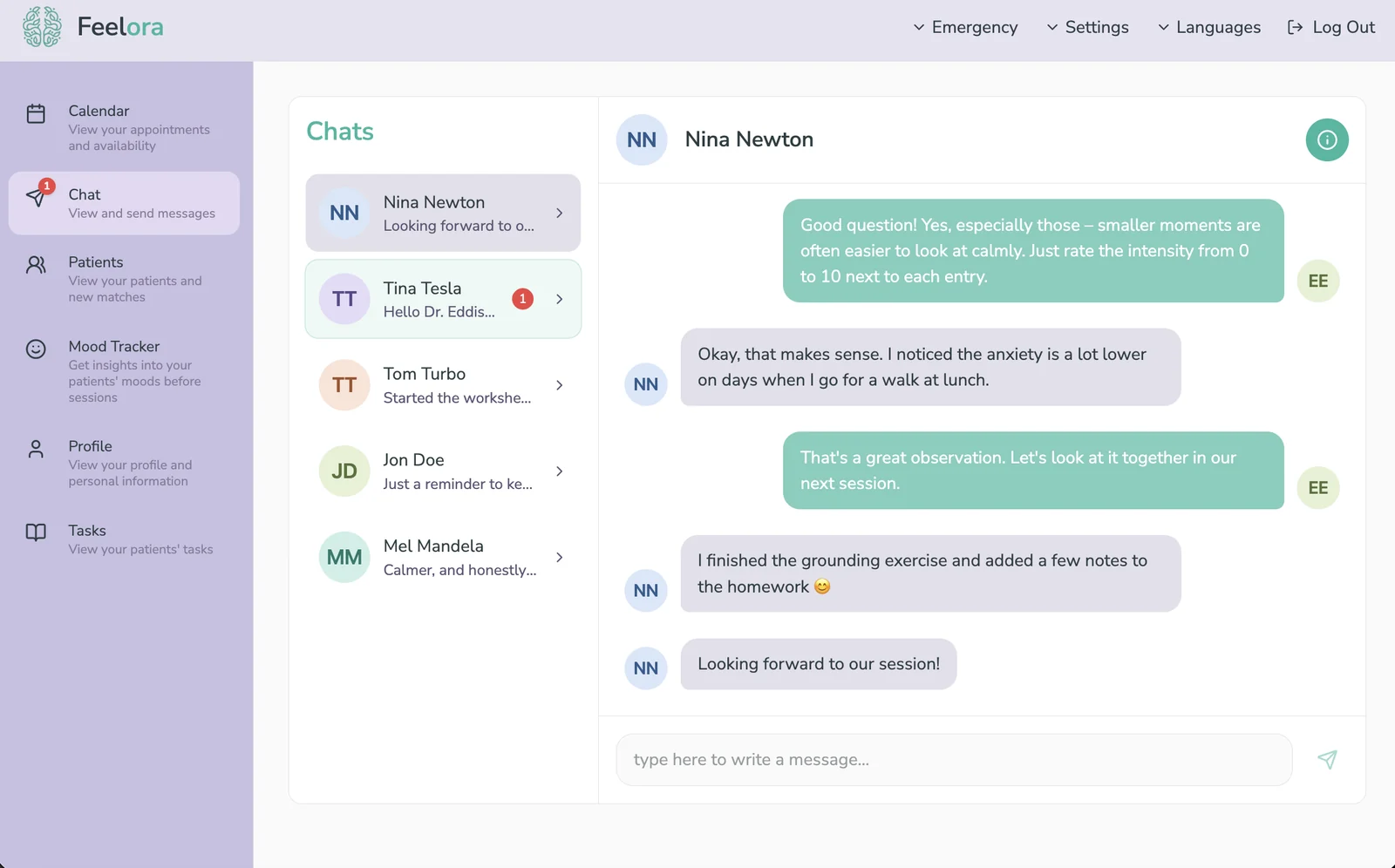
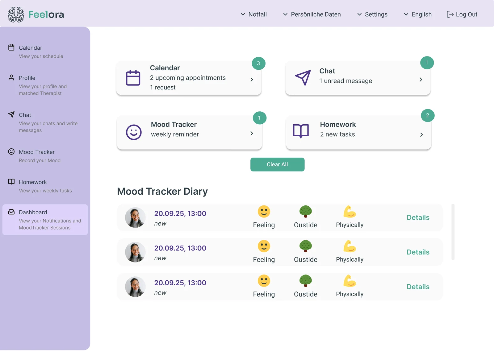
The live product: the patient dashboard and the therapist chat.
One Login, Two Roles
This screen didn't exist in Figma. It came out of development: we used AWS Cognito for sign-up and login, and Cognito's hosted flow has no step where a new user can say whether they're a patient or a therapist. Since the role decides which app, questionnaire and permissions someone gets, it had to be known before they ever reached Cognito.
So the login button on the landing page leads to a role choice first, and each card starts the matching Cognito flow. It also let us treat the two groups differently at launch: therapists could sign up right away, while patients joined a waiting list.
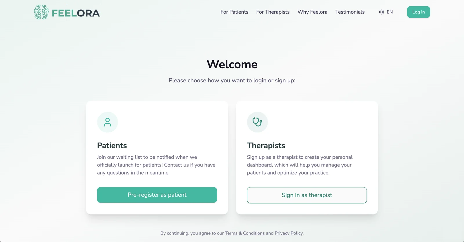
The role choice before login, designed and built directly in code.
The Onboarding Questionnaire: Matching Starts Here
The matching only works if we know enough about both sides. Patients answer 17 questions and therapists 18, covering everything from concerns and specialties to languages, setting and availability. That's long for an onboarding, and for patients it comes at a vulnerable moment, so the design goal was simple: nothing on the screen should compete with the question.
I designed four directions for the team to decide on: a lavender or a pale green background, each with either a large logo watermark or a small logo in the corner. We chose the pale green with the small logo. The watermark looked distinctive, but it sat right behind the question and the answer options; the calm, almost empty background let users concentrate fully on answering.
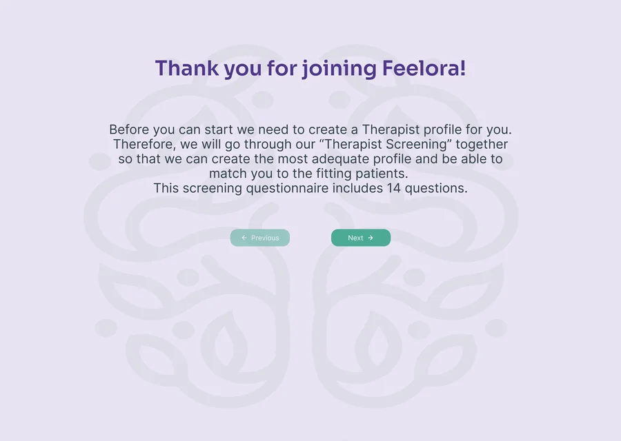
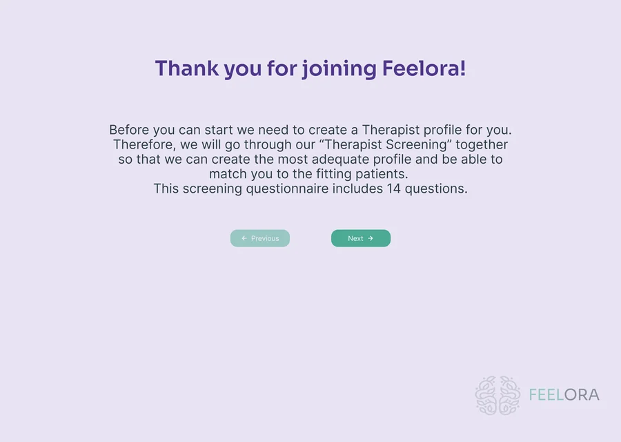
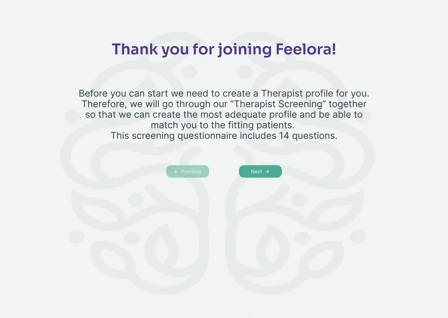
Patients and therapists go through the same flow: a progress bar with the question count, one clear question, and large answer cards. Every input is validated before continuing, with a short message right at the field, so nobody has to guess why "Next" doesn't work.
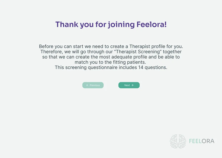
Both sides start with a plain-language consent step that explains how health data and AI are used. After that, the questions mirror each other: patients describe what they're struggling with, therapists name the specialties they treat, and both say when they're available. Each side also gets questions only it needs: patients go into more detail about their concerns and preferences, while therapists provide their titles, license number and the price range of their sessions, including insurance contracts. All of it feeds the matching, and patients end with their matched therapist, whom they can accept or swap.
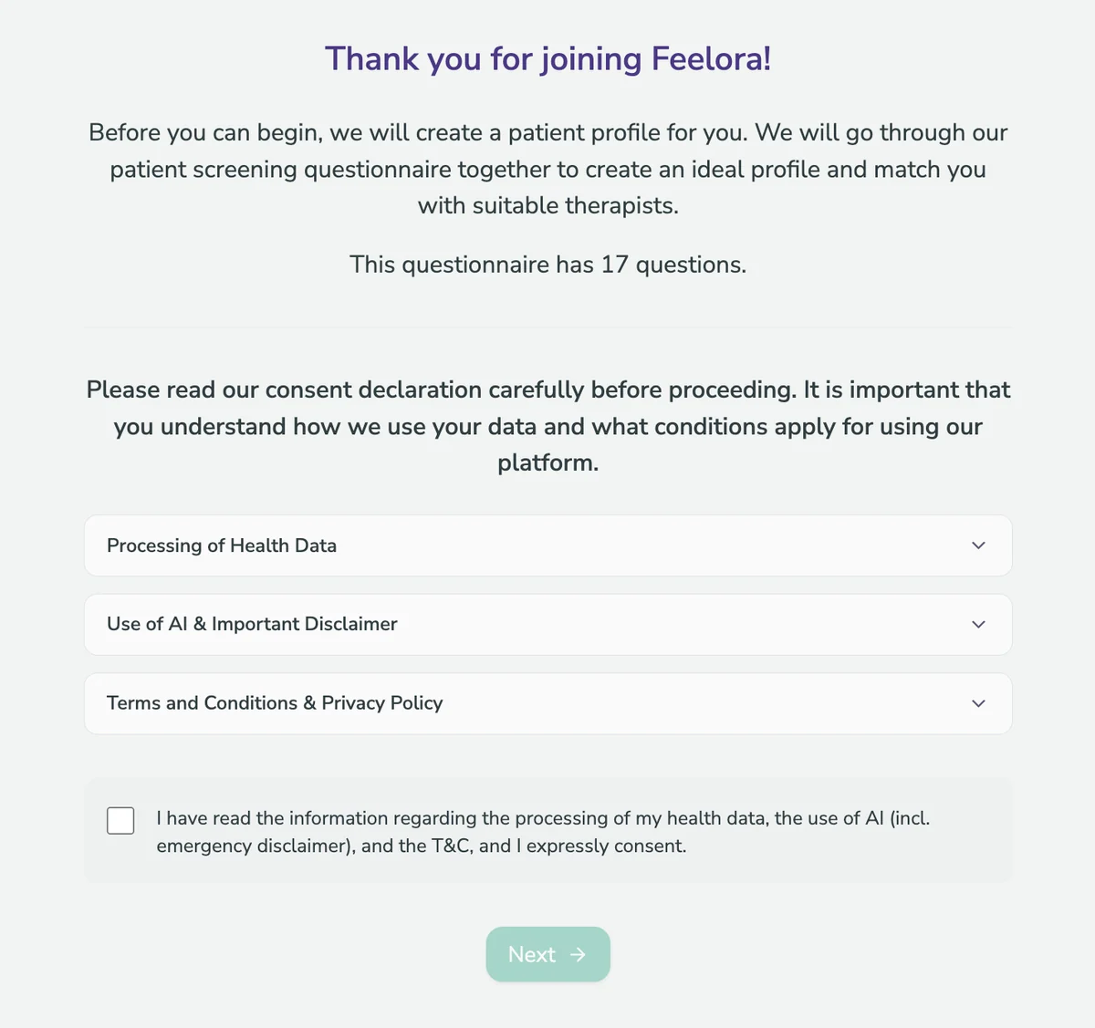
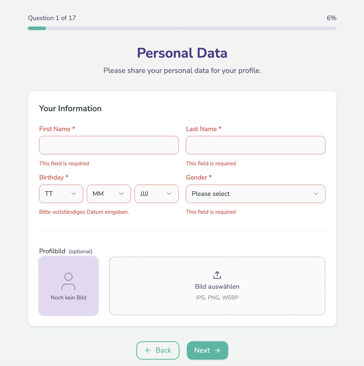
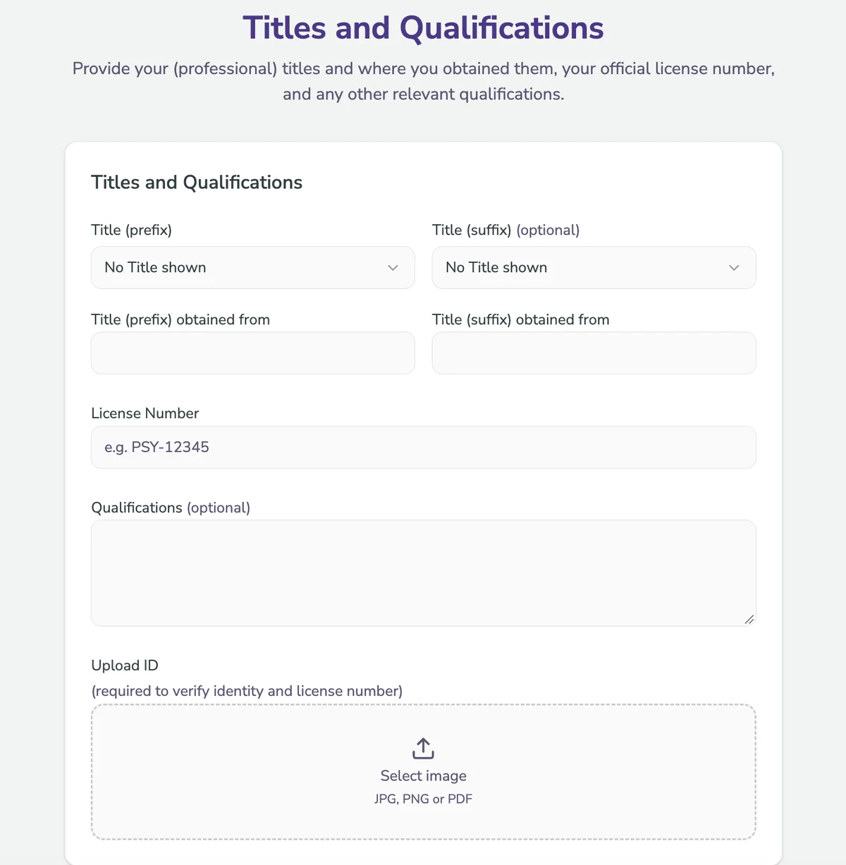
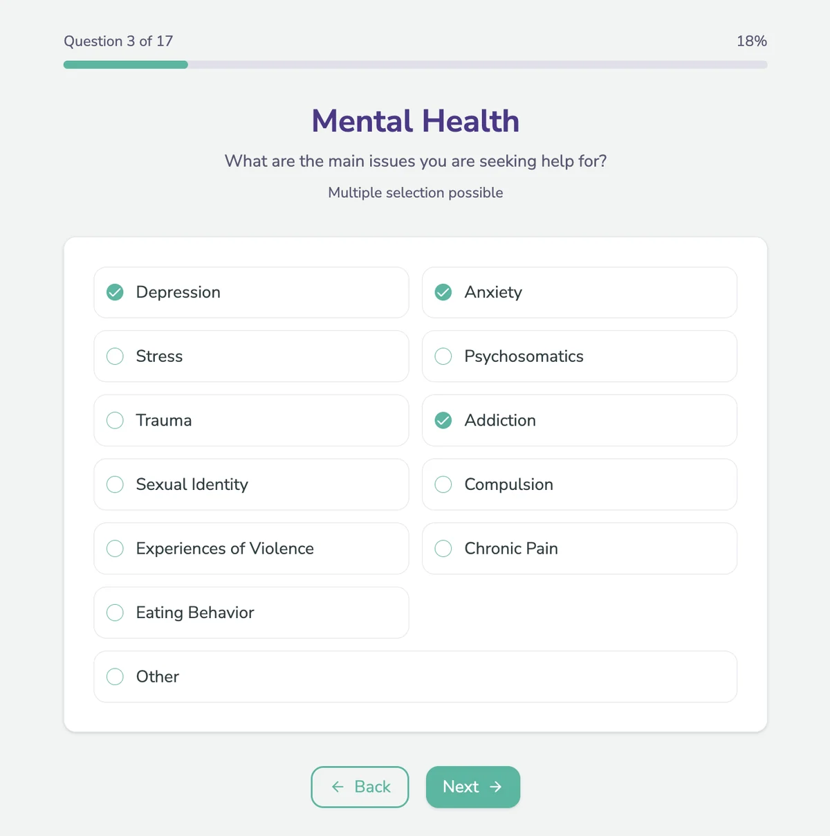
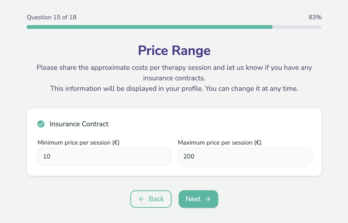
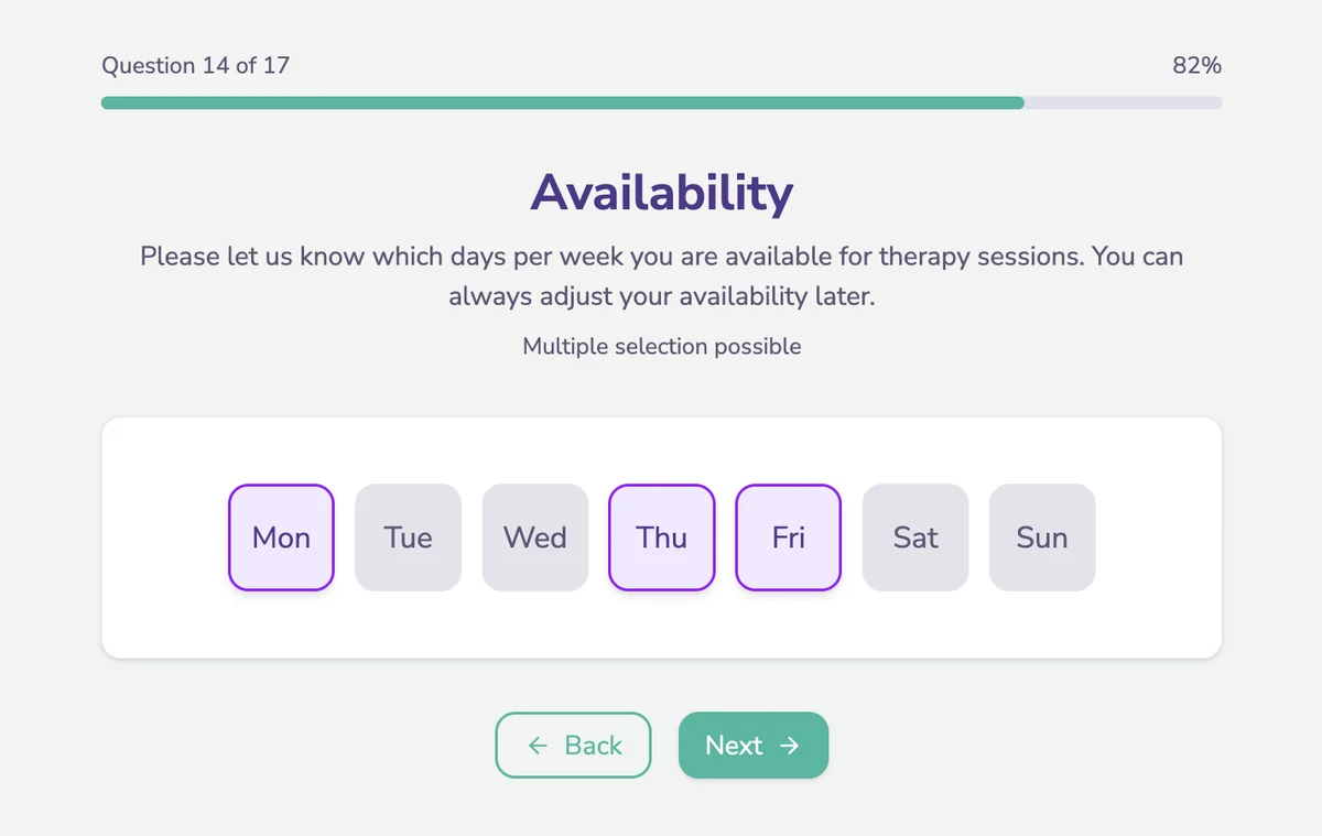
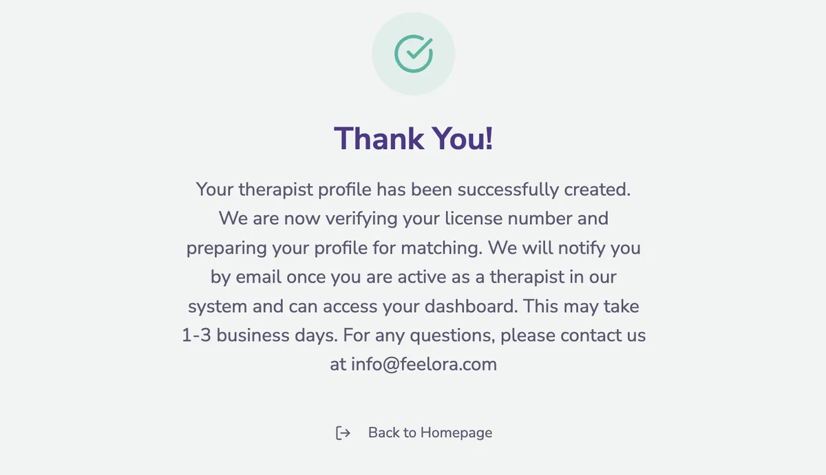
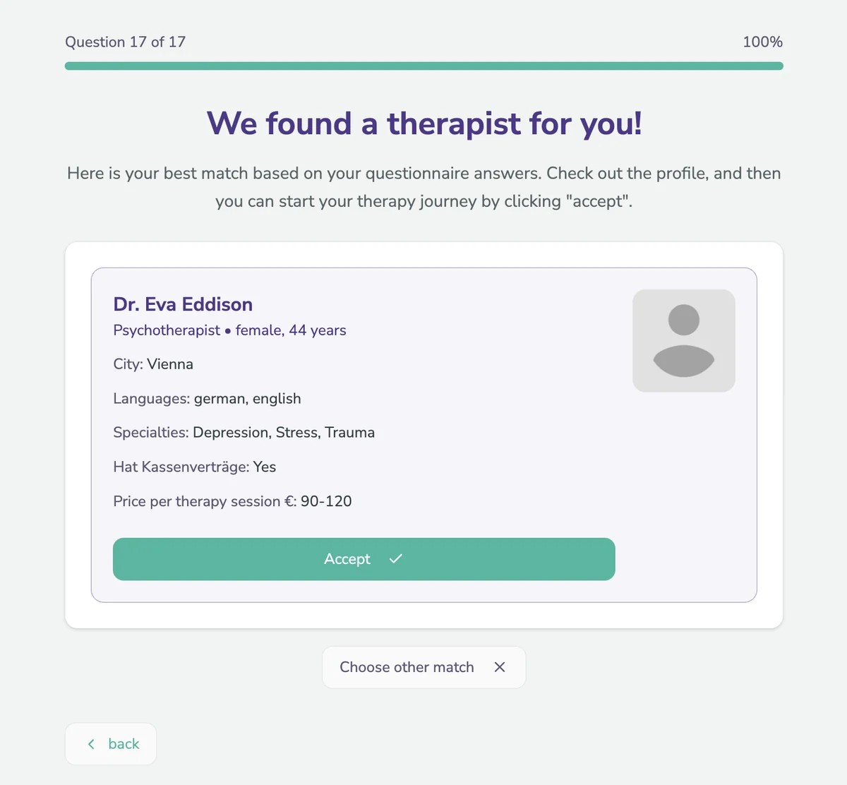
Both flows side by side: consent, error handling on empty fields, licensing, concerns and pricing, availability, then the verification notice and the match.
A therapist's profile only becomes visible to patients once it's verified, a promise the patient side depends on. Verification happened on a separate, deliberately basic admin page, reachable only by direct link for admin accounts: a list of new registrations with each therapist's ID picture and license number, which we checked manually before approving the profile.
Not knowing is a valid answer. Matching uses the therapy school (e.g. behavioral or psychodynamic), but most patients have never heard of them. Instead of letting them guess, "Answer Questions" opens a short set of follow-up questions about what they want from therapy, and we derive the fitting orientation from those answers.
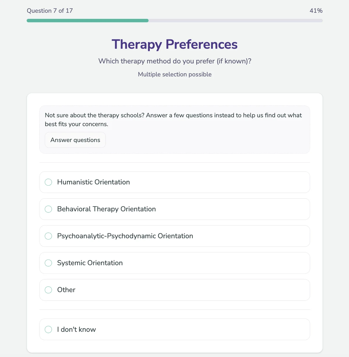
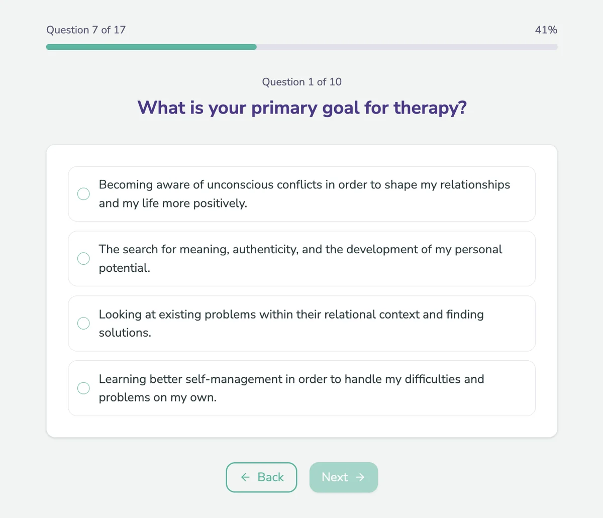
The therapy preference question and one of the follow-up questions behind "Answer Questions".
The Dashboard: From Everything at Once to One Focus per Tab
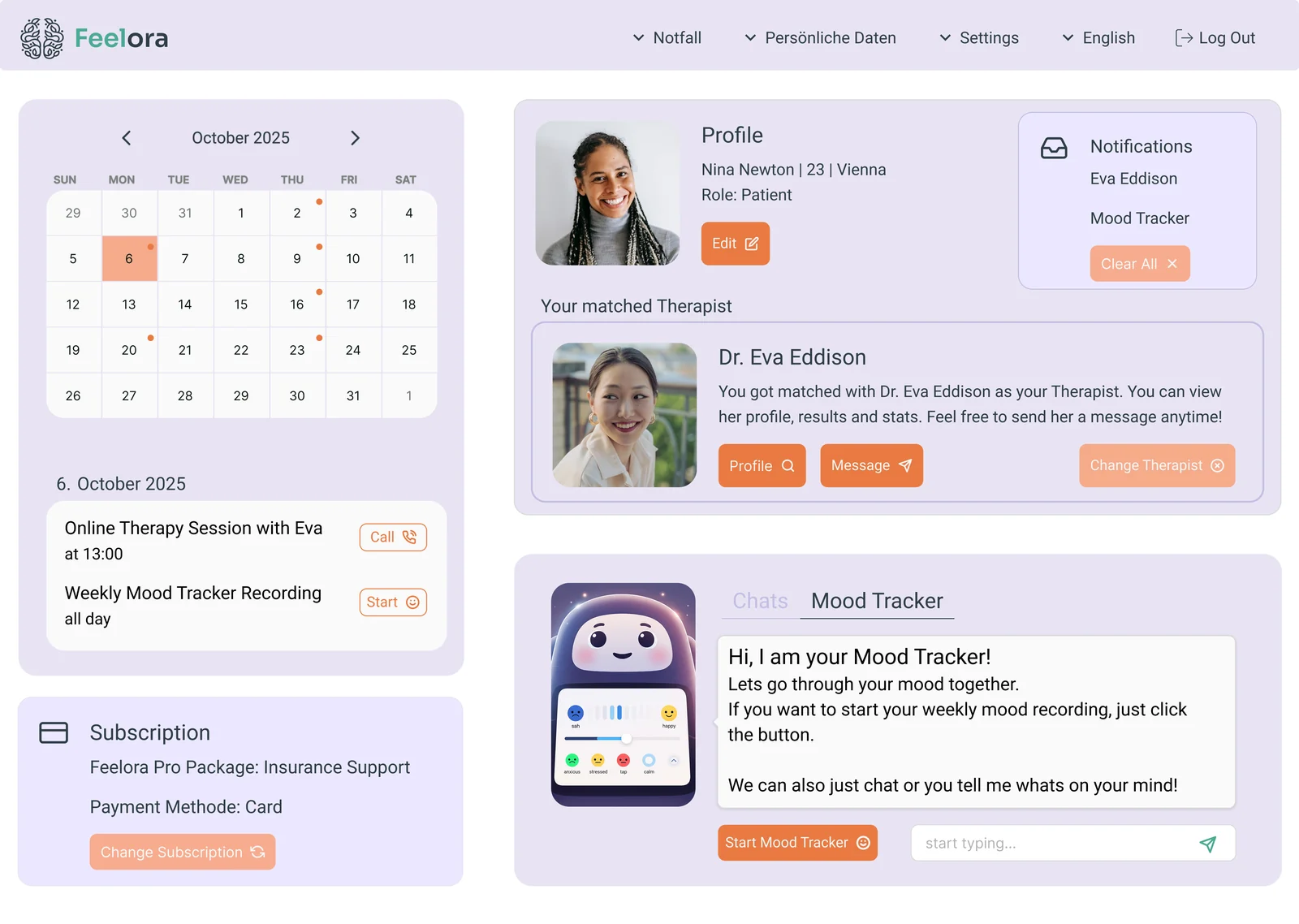
I started designing the patient side, assuming the therapist side would follow the same structure. The first dashboard put everything on one screen: calendar, profile, matched therapist, notifications, subscription and a chatbot-style mood tracker. It showed the whole product at a glance, but every element competed for attention, and it would only get more crowded with each feature.
I decided on a sidebar with one tab per feature instead. The dashboard became a calm starting point: what's new, what's next, and the mood diary. Everything else lives one click away. The live patient dashboard shown earlier is built on exactly this structure.
Mood Tracking: From Patient Entry to Session Prep
The mood tracker is where both sides meet. Patients log how they feel, sleep, eat and move with quick tap-to-answer chips instead of free text. If they turn on sharing on their dashboard, their therapist sees every entry in an overview and can open the details before the next session, so the session starts with context instead of "So, how was your week?".
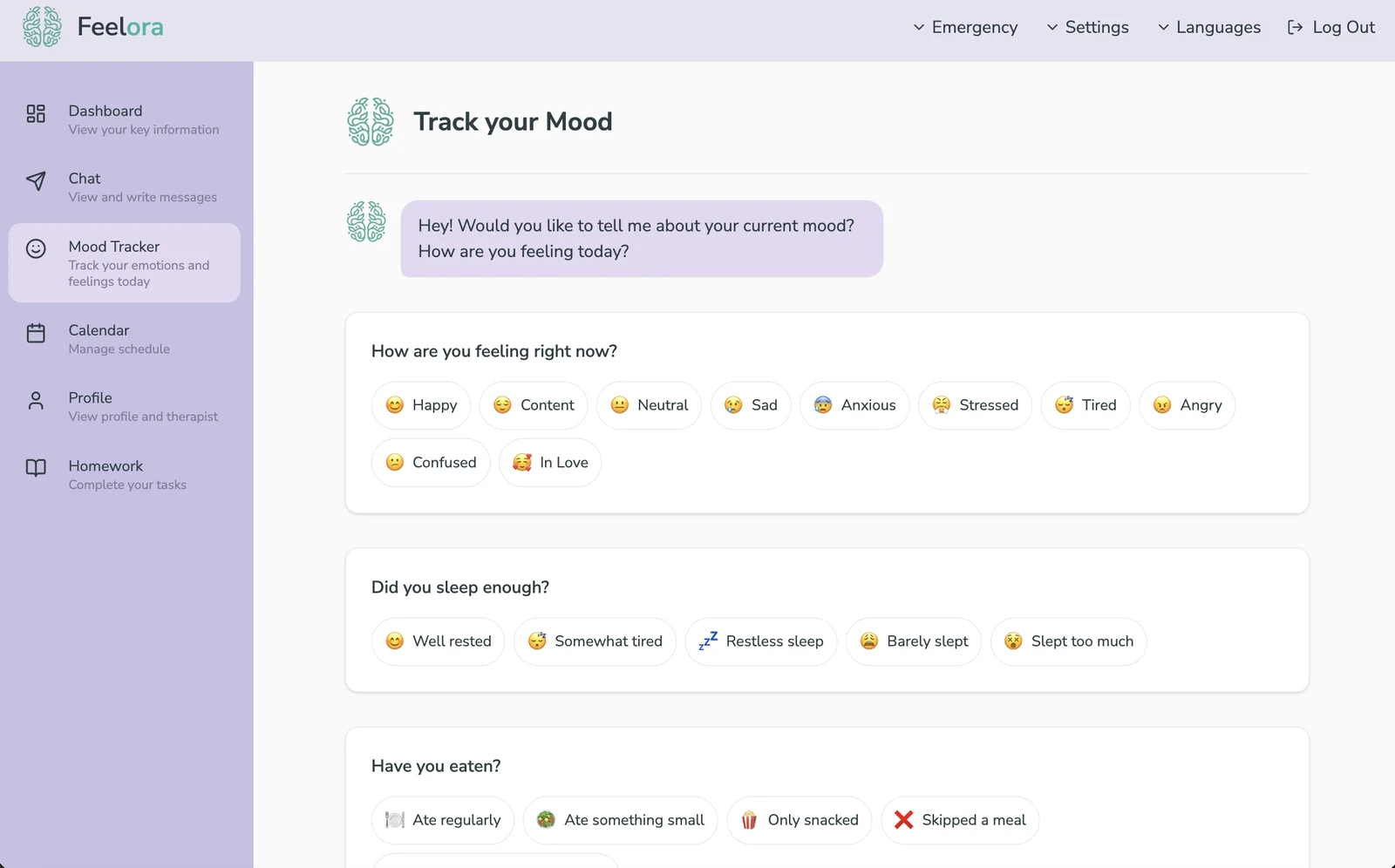
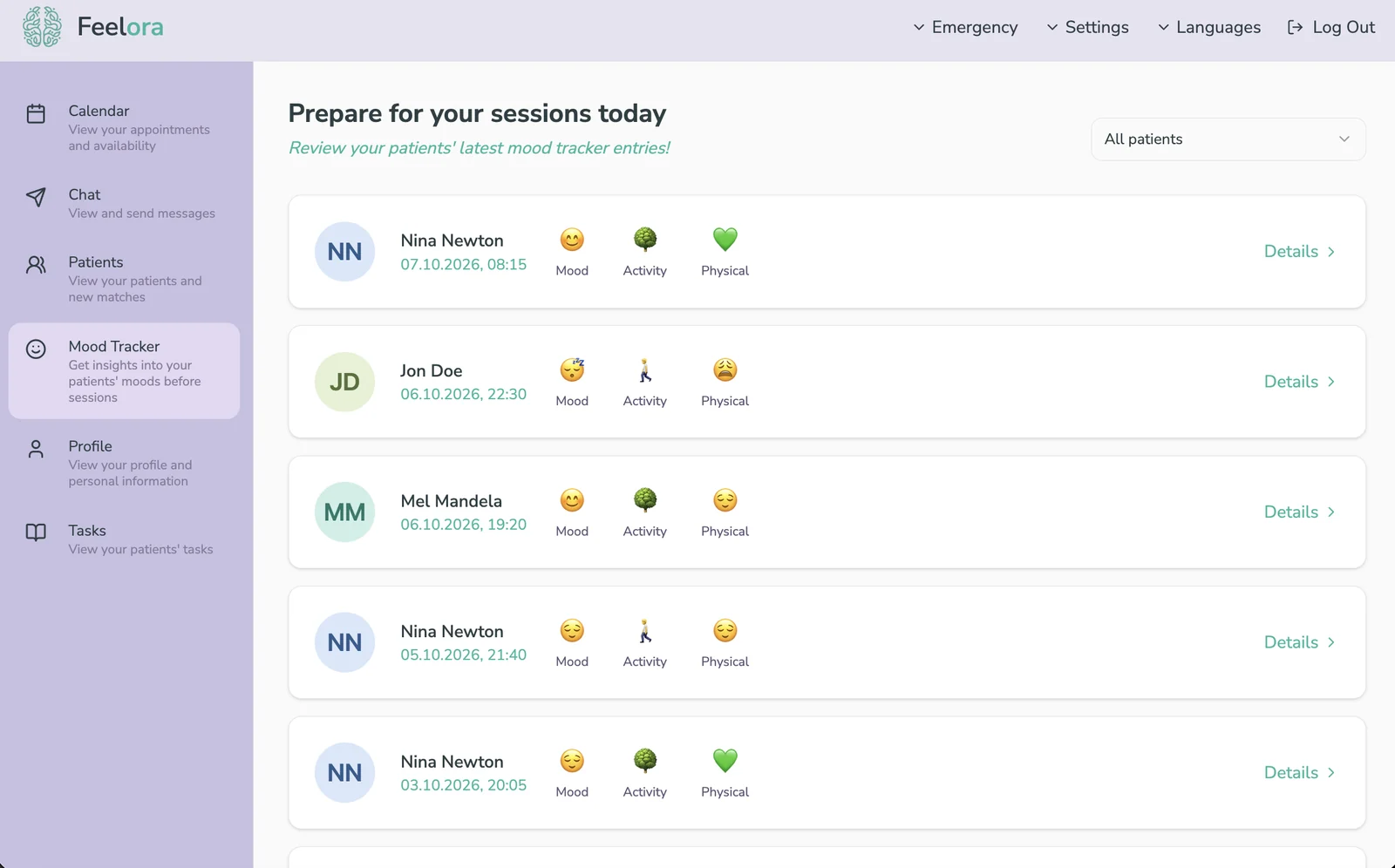
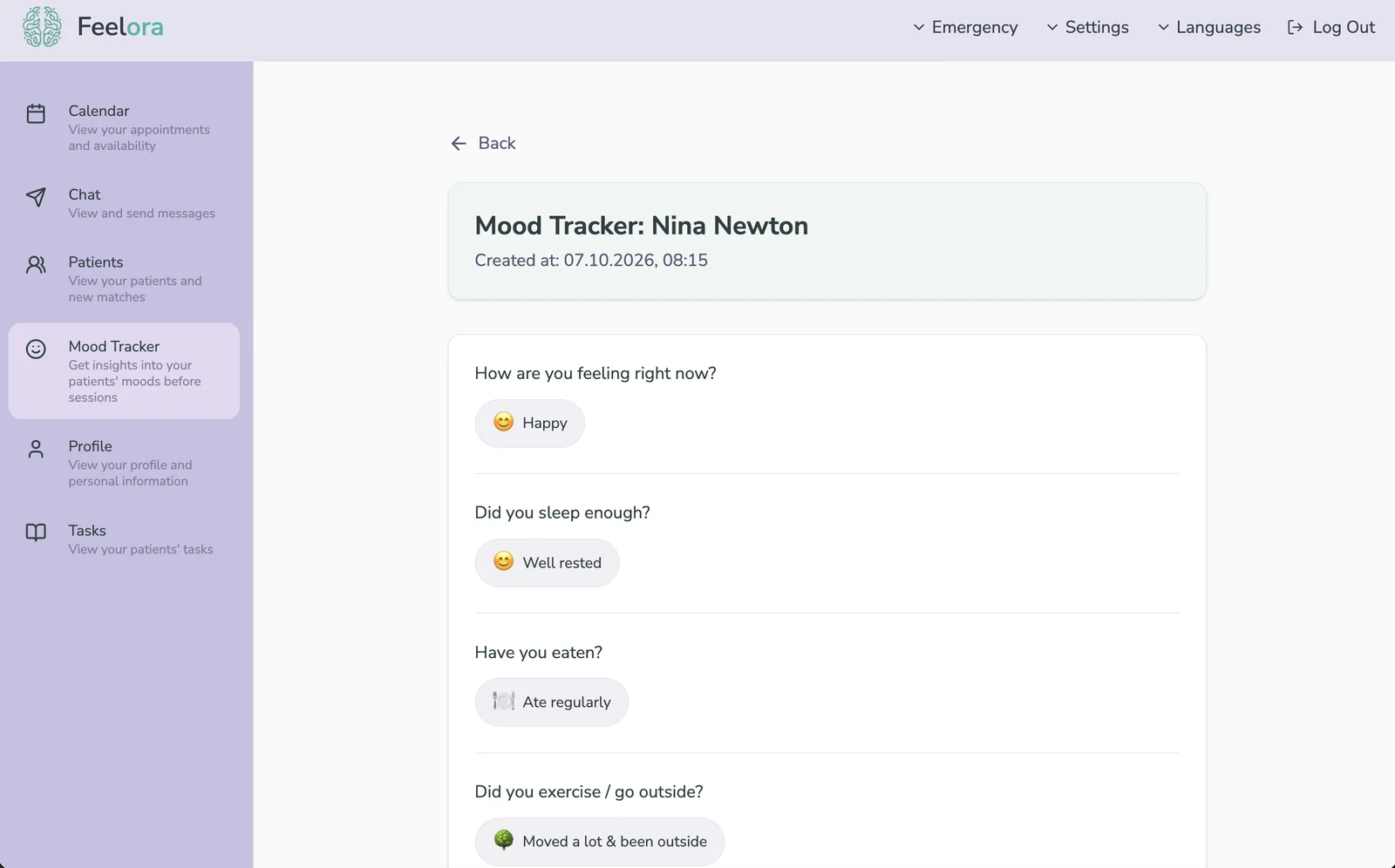
Patient entry → therapist overview → entry details.
Safety: Help Is Always One Click Away
Feelora wasn't built for acute crises: matching and booking take days, and a mental health platform has to be honest about that. So both apps have an "Emergency" entry in the top navigation, visible on every screen, rather than tucked away in settings or the FAQ. Therapists have it too, so they can point a patient to the right service quickly.
The page is ordered by urgency. The emergency numbers 144 and 112 come first, large and set apart in red. Below them, Austrian helplines sit on calm cards with their availability, so people can find a service that fits their situation, like telephone counseling, the socio-psychiatric emergency service or help for children and adolescents.
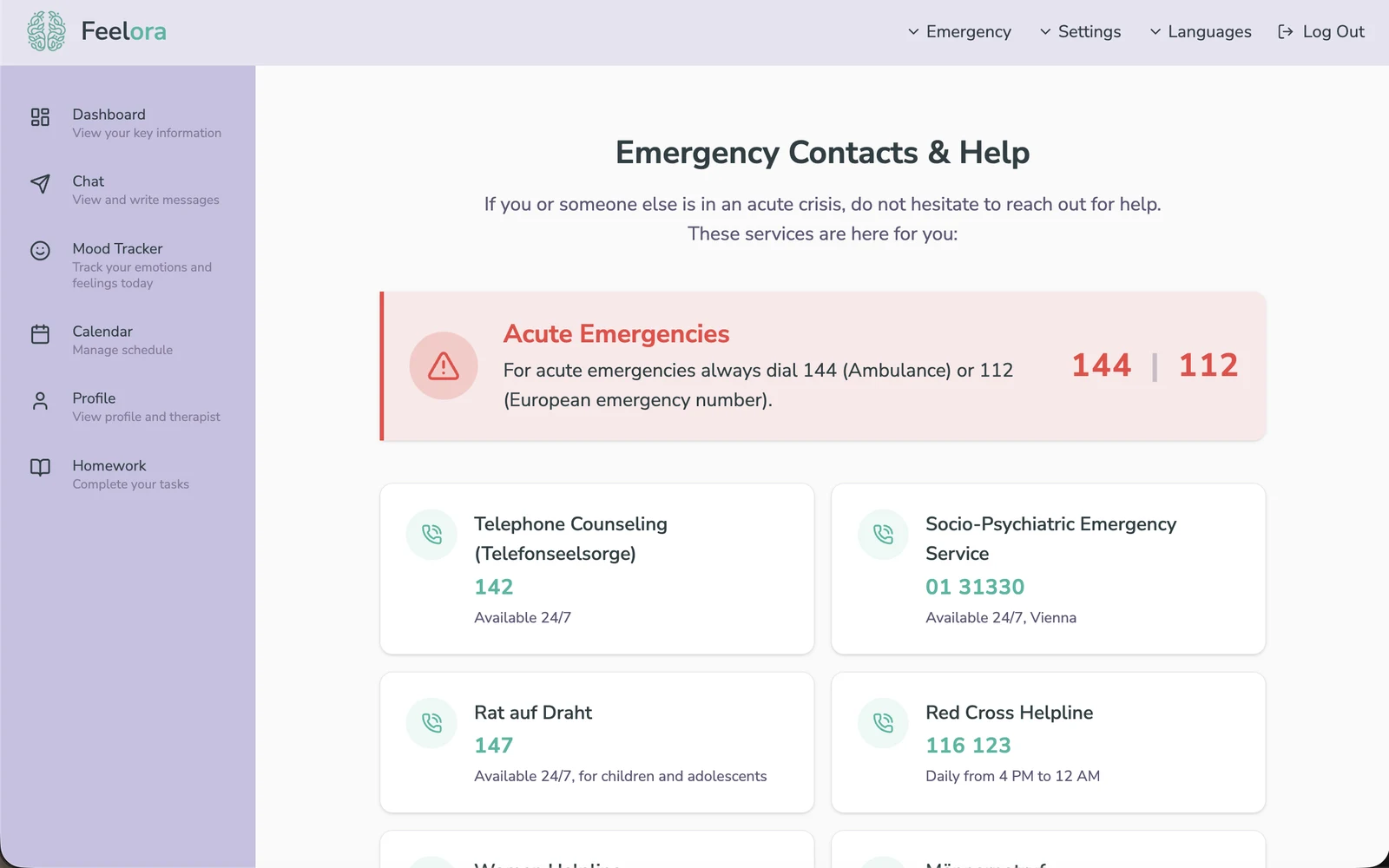
The emergency page, reachable from the top navigation in both apps.
The Pilot: What Real Use Revealed
We tested the MVP with three therapists and three patients. The feedback was clear: for both sides to get real value out of Feelora, two things were missing that we had cut from the MVP scope. We added them in the next iteration, together with homework, which we decided to ship at the same time.
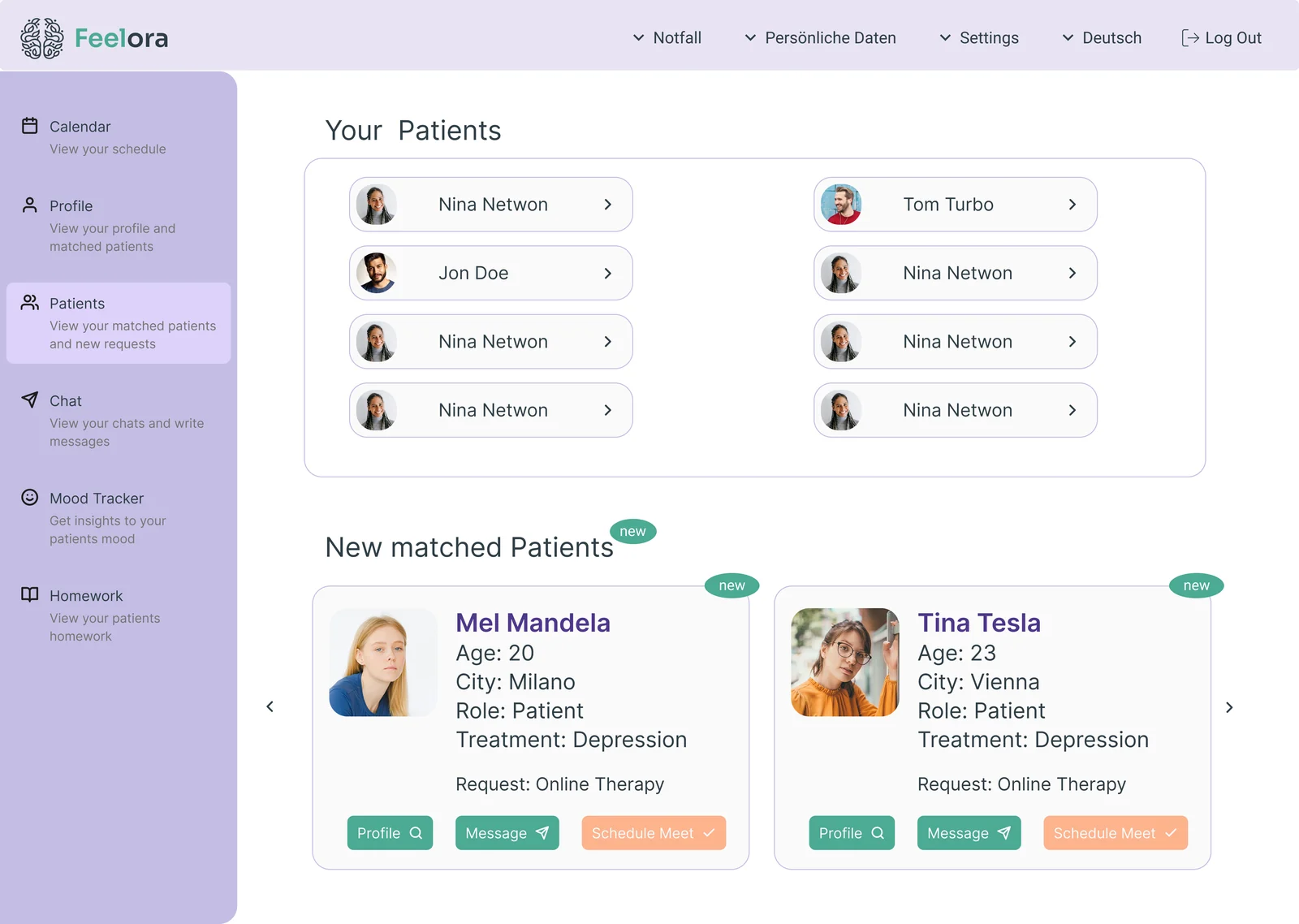
In the MVP, therapists managed patients through the chat list, which doubled as their patient overview. In practice that wasn't intuitive, so after the pilot I built a dedicated patients tab.
The original idea in Figma was simple: new patients appear under "New matched patients", the therapist schedules a first meeting, and that moves the patient out of "new" on its own. In reality this didn't work, because of a backend constraint: only patients could book a session, so there was nothing on the therapist side to trigger the move.
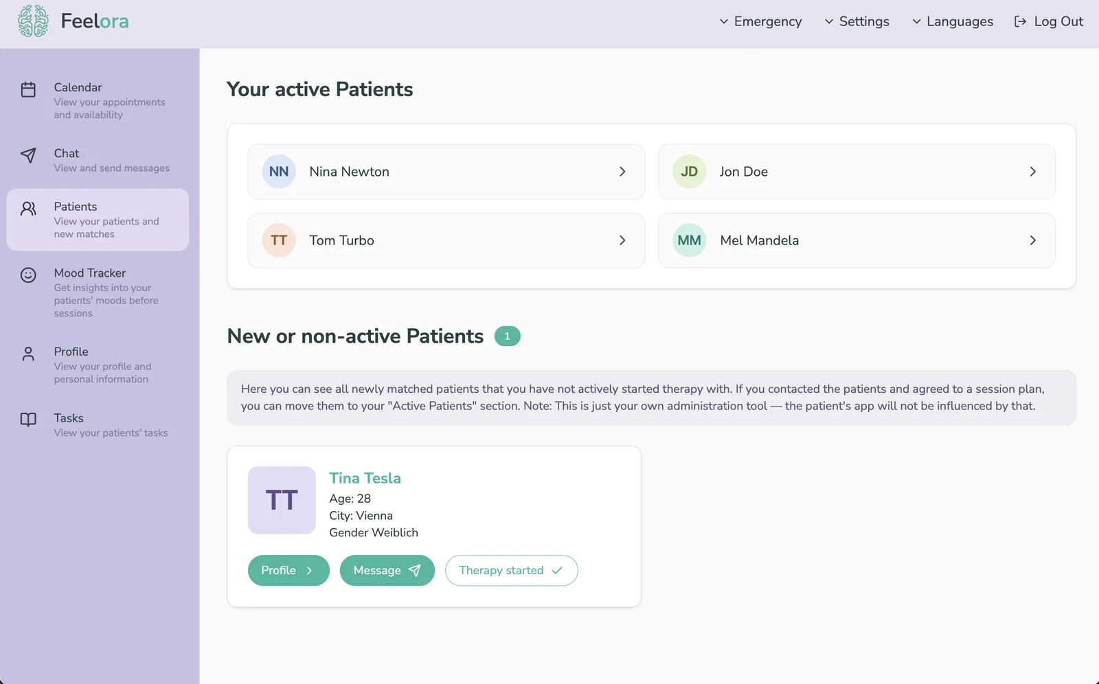
I didn't want to give up the patient management side of the feature, so I added a "Therapy started" button instead. Therapists are busy and tend to forget pending patients, but seeing that someone is still waiting is a reminder. Truly new matches carry a "New" badge, which disappears once the therapist has seen the match. From there they can make plans with the patient, and once therapy starts, they move the patient to their active patients with one click.
Tested before shipping. When I showed the idea to one of our therapists, they really liked having a management option, but felt not everyone would understand how to use it. So I added a short explanation field above the new patients, which also makes clear it's only their own administration tool and doesn't change anything in the patient's app.
The calendar had never been part of the MVP. In Figma I had only sketched its functionality, on purpose: I planned to build it on an existing calendar library rather than from scratch. After the pilot I built the full scheduling flow directly in code.
Therapists manage their own schedule: working days, session length, time slots and booking notice. Patients can then only book from the slots their therapist has set. When a slot is booked, the therapist gets notified and can add a video link or a location to the booking. Therapists can switch between a weekly and a monthly view, because in our early interviews they wanted both equally.
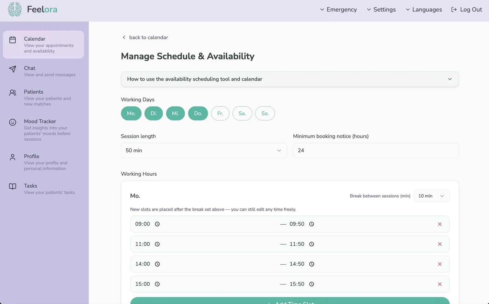
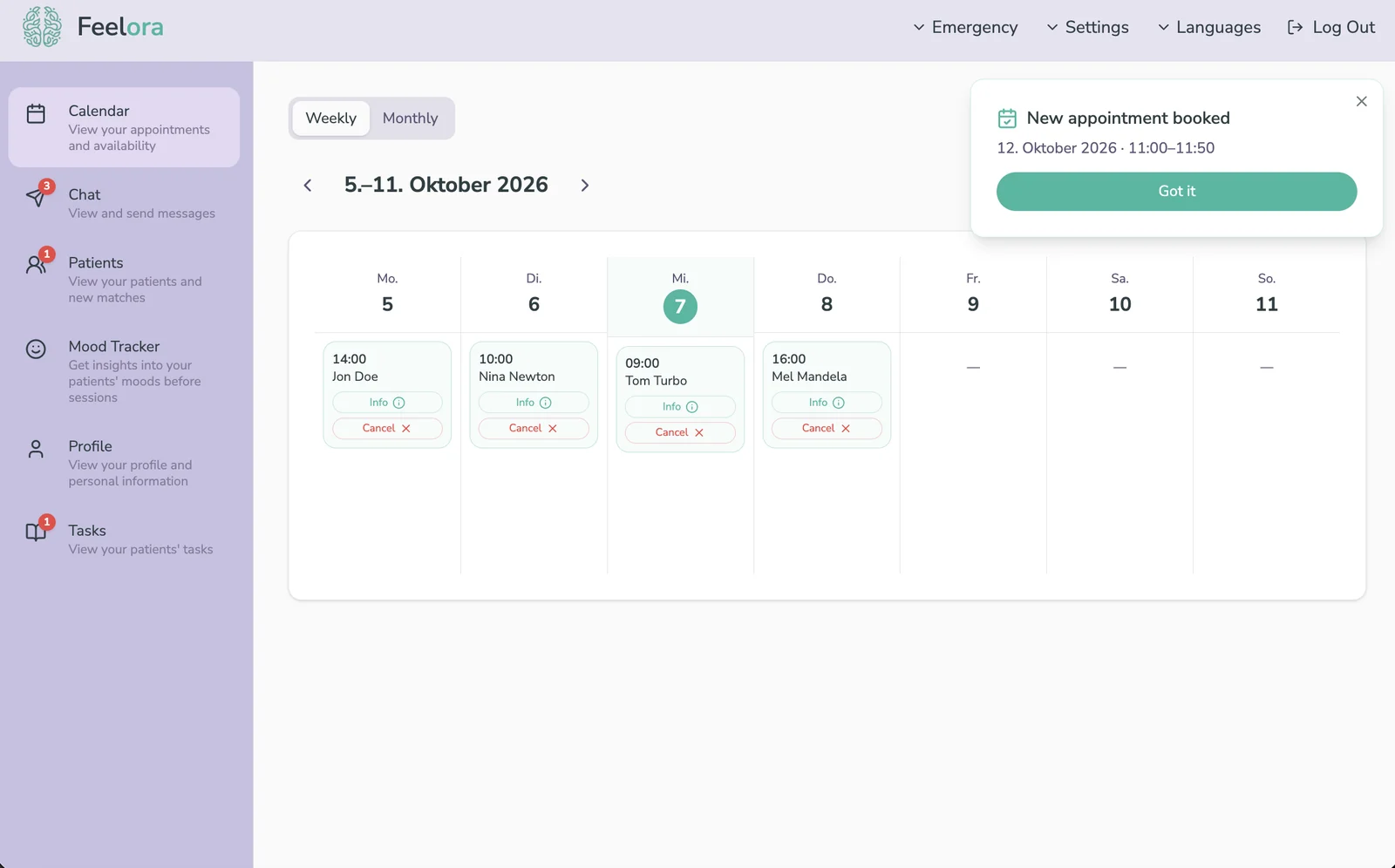
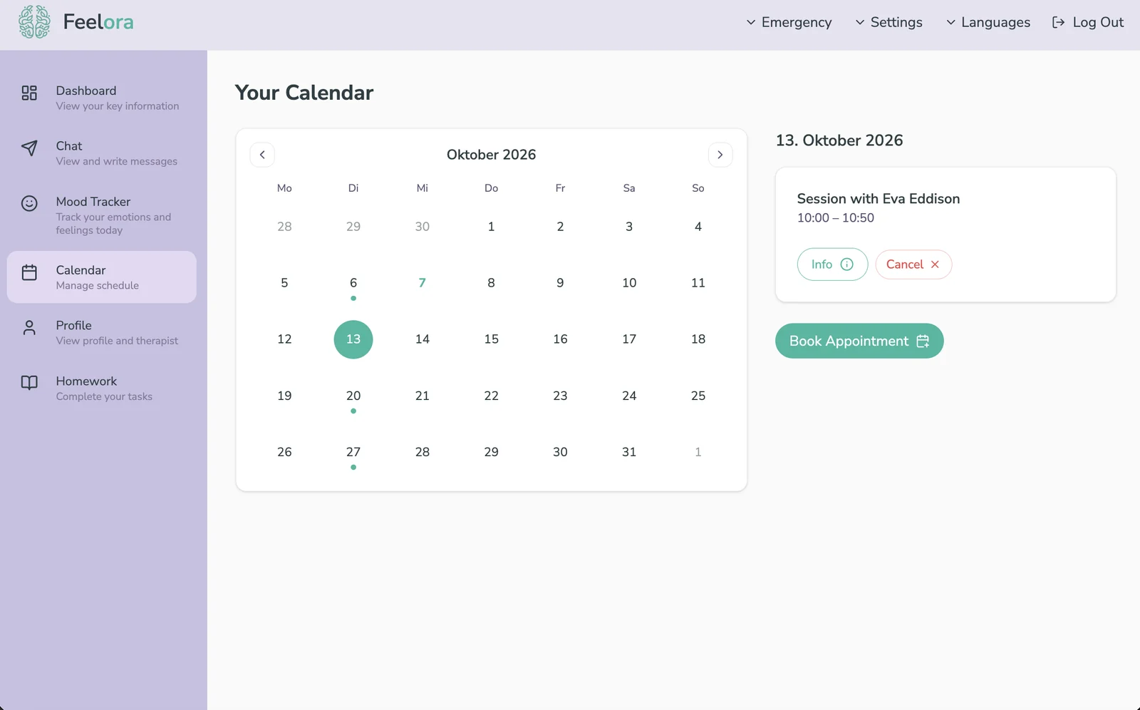
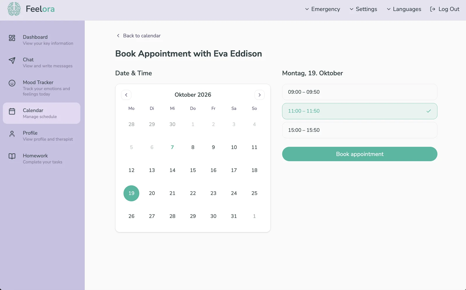
Availability settings and the therapist's weekly calendar, then the patient's calendar and booking from the available slots.
Therapists can assign homework to their patients between sessions and see the status of each task at a glance. Patients mark tasks as done or repeat them, and can leave notes on each one, either just for themselves or shared with their therapist.
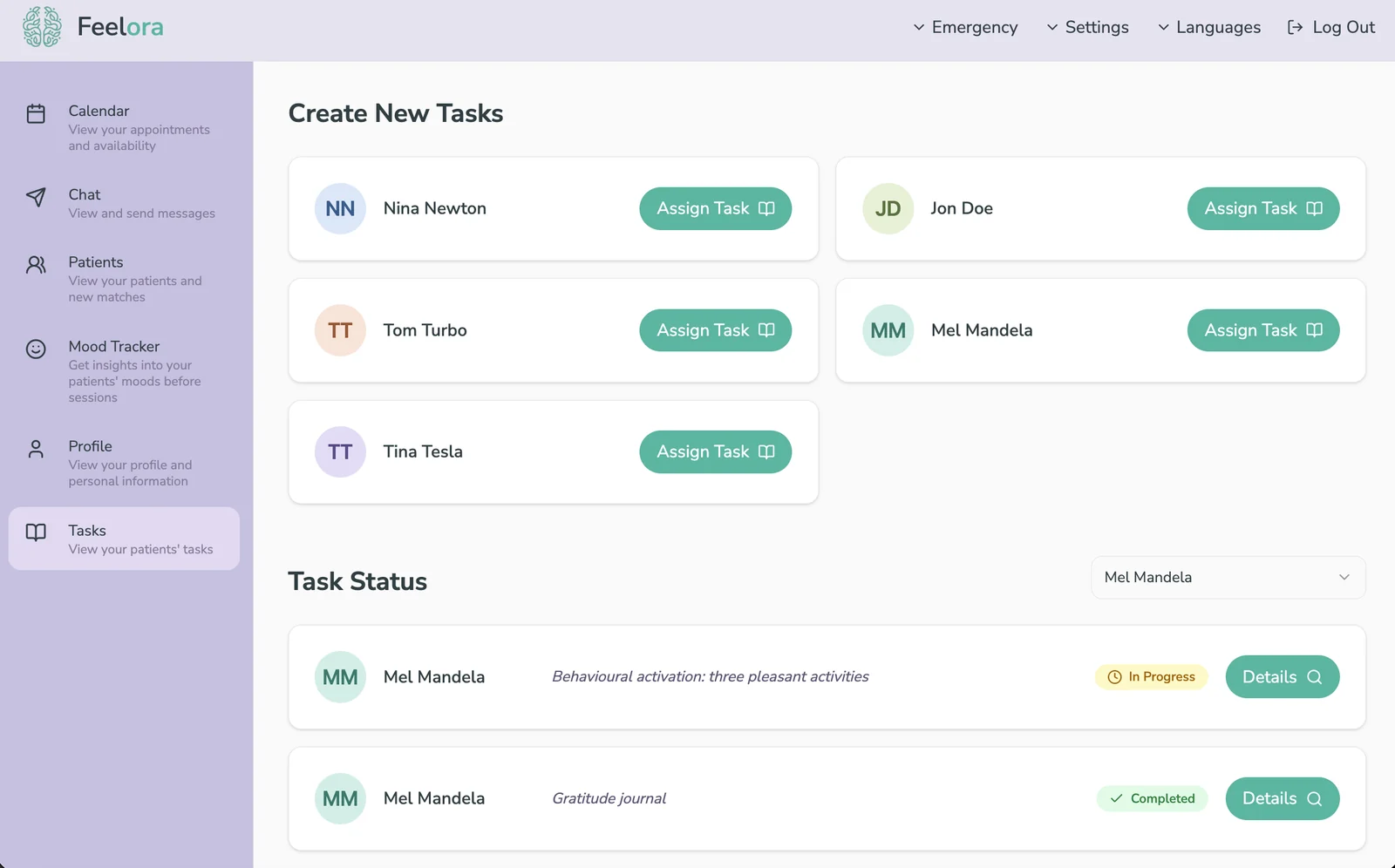
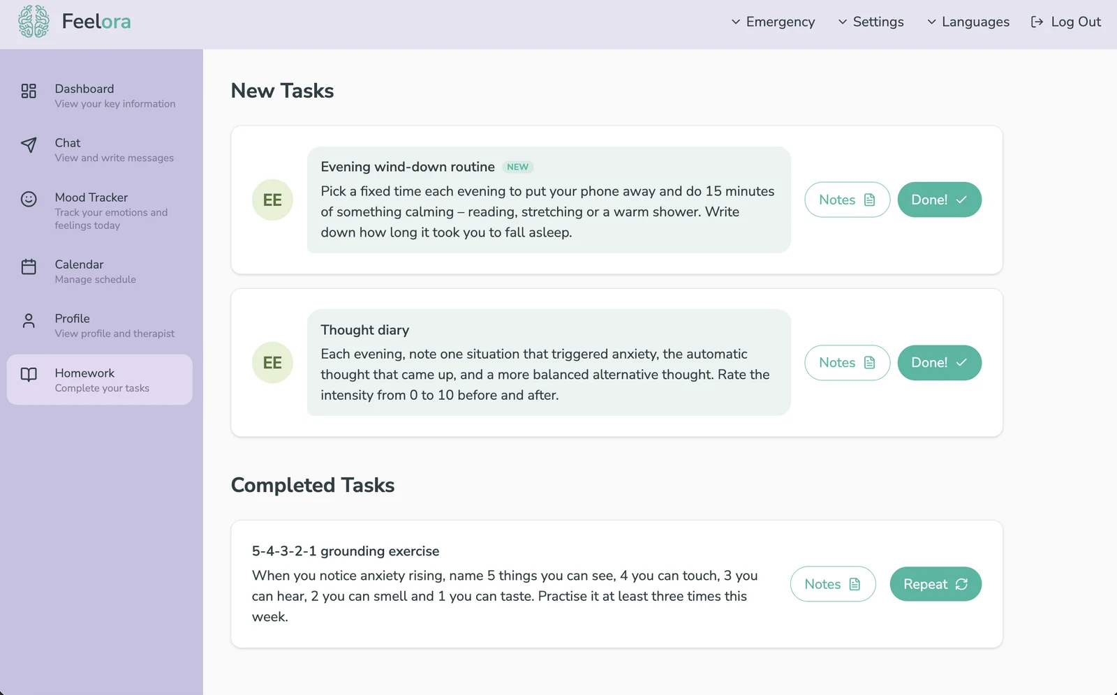
Assigning and tracking homework, and the patient's task list with notes.
Design System & Code: No Handoff
Working as both designer and the only frontend developer removed the handoff entirely, so I set up the Figma file the same way I'd structure the code:
- Three levels of components: global ones like buttons and inputs, domain components like the patient and therapist sidebars and navbars, and the screens built from them.
- One style guide: shared colors, typography and spacing, with auto layout everywhere so screens stayed consistent as content changed.
- Straight into code: Figma variants mapped directly to React components using CVA, Tailwind CSS and shadcn/ui.
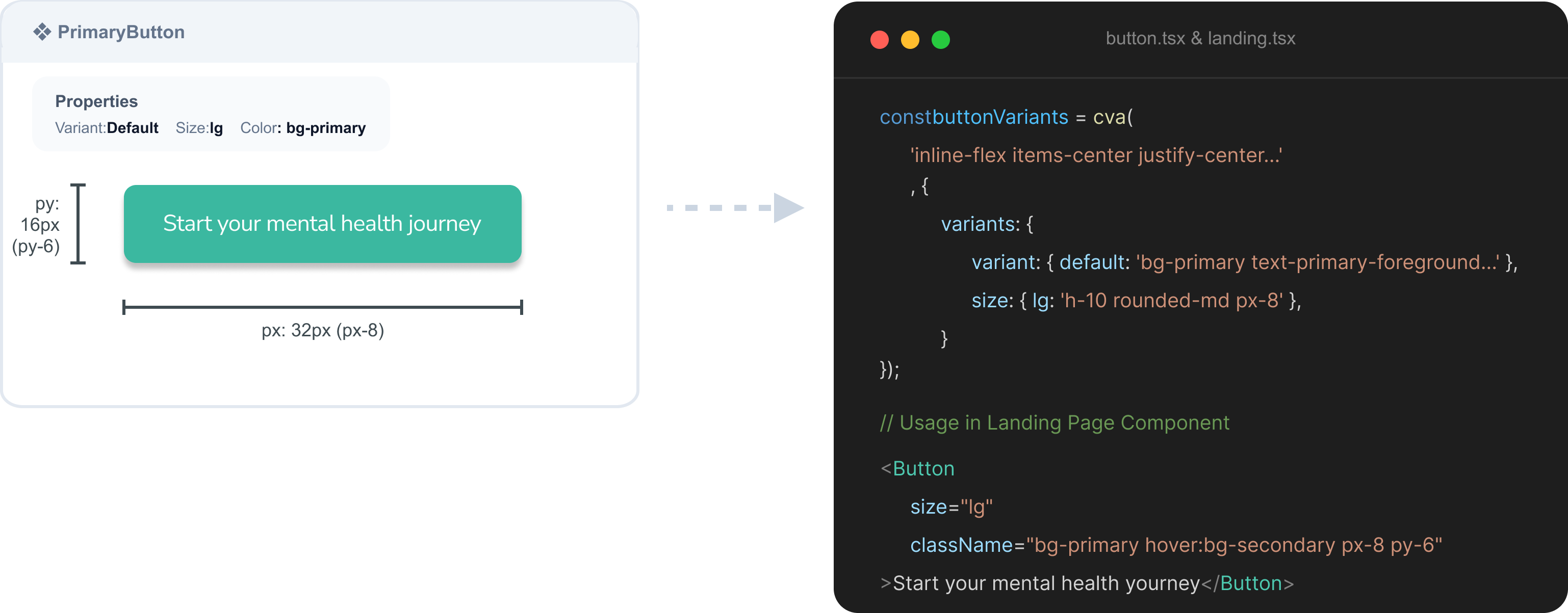
Mapping Figma component variants directly to React using CVA and Tailwind CSS.
Because the components matched one to one, later changes like the patients tab and scheduling didn't need another full Figma round. Under time pressure I designed them directly in code, on top of the same system.
If you're interested in the code and architecture, you can find the frontend on my GitHub: github.com/vicixvictoria/feelora.
Mobile App Design: One Version, Then Set Aside
I also designed a mobile version of both apps, based on the web designs. The sidebar became a bottom tab bar with the same features, and the content stacked into cards sized for one-handed use, built from the same colors and components. It stayed a single first version: the team decided to put all our time into the web MVP, so the mobile screens were never tested or iterated on.
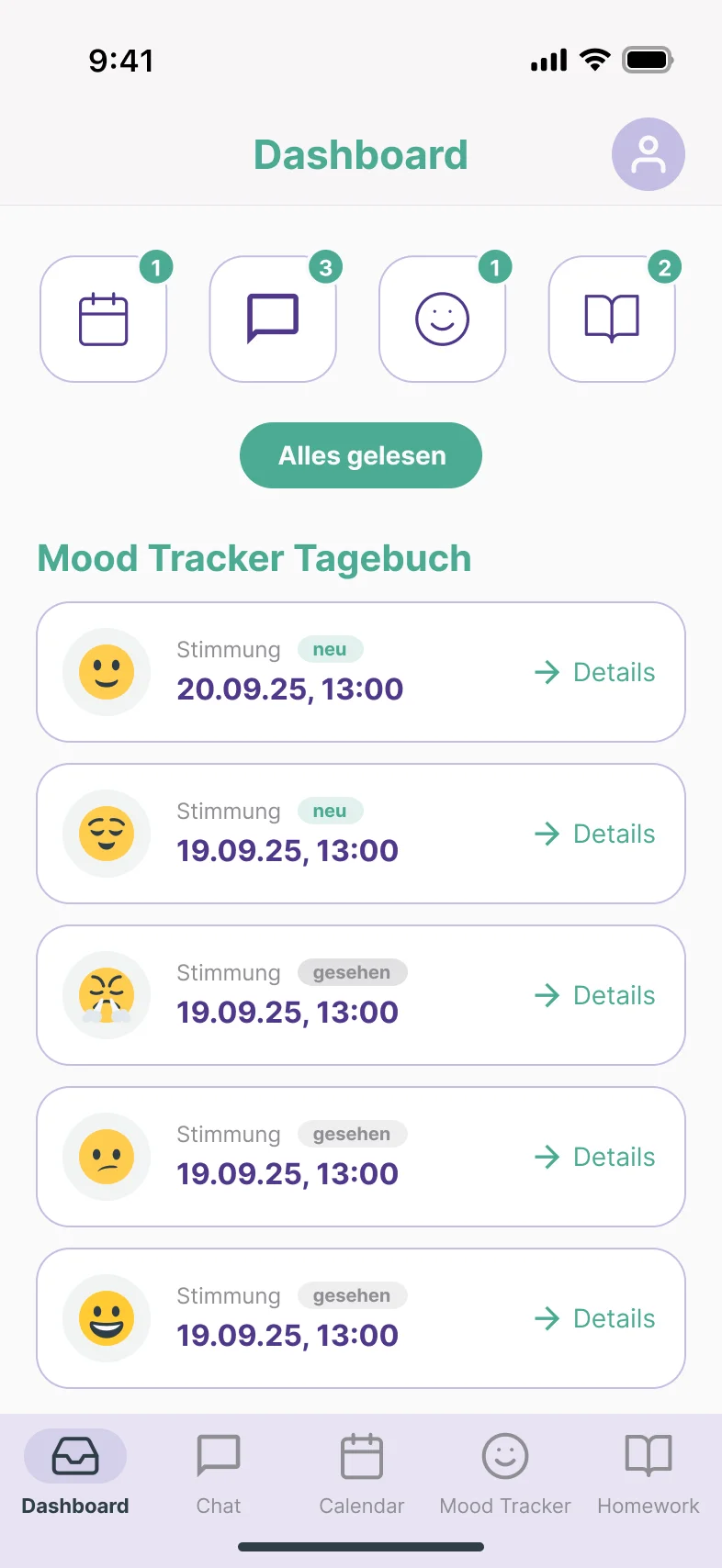
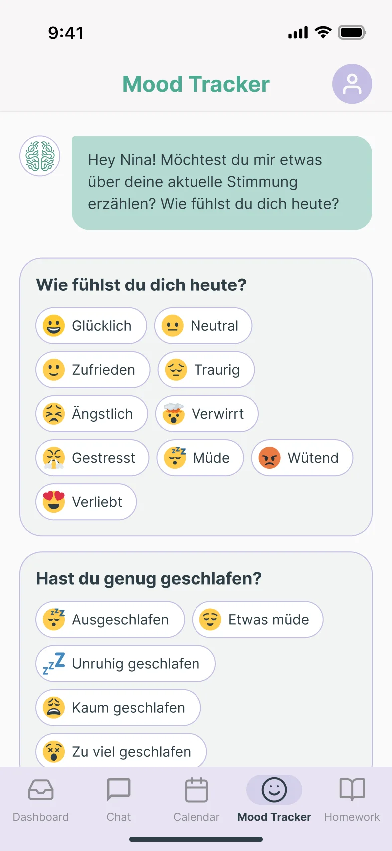
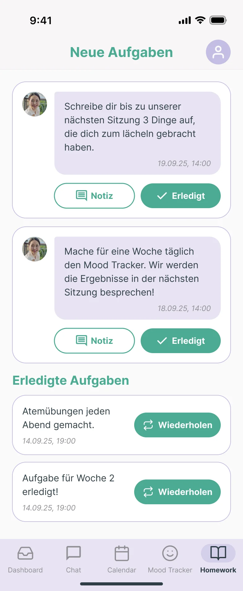
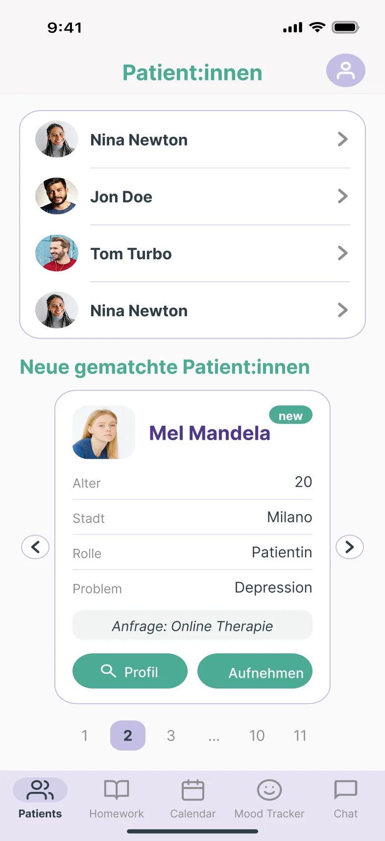
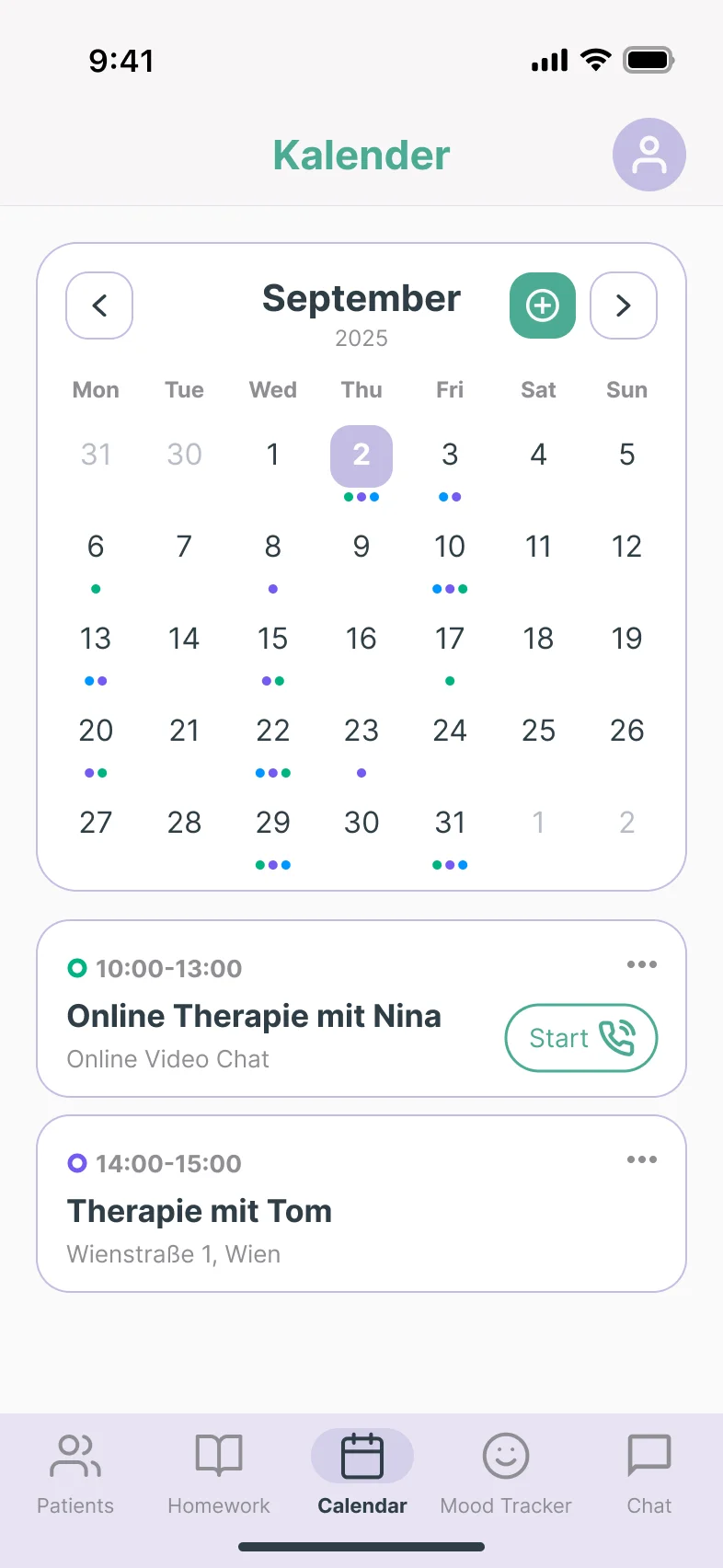
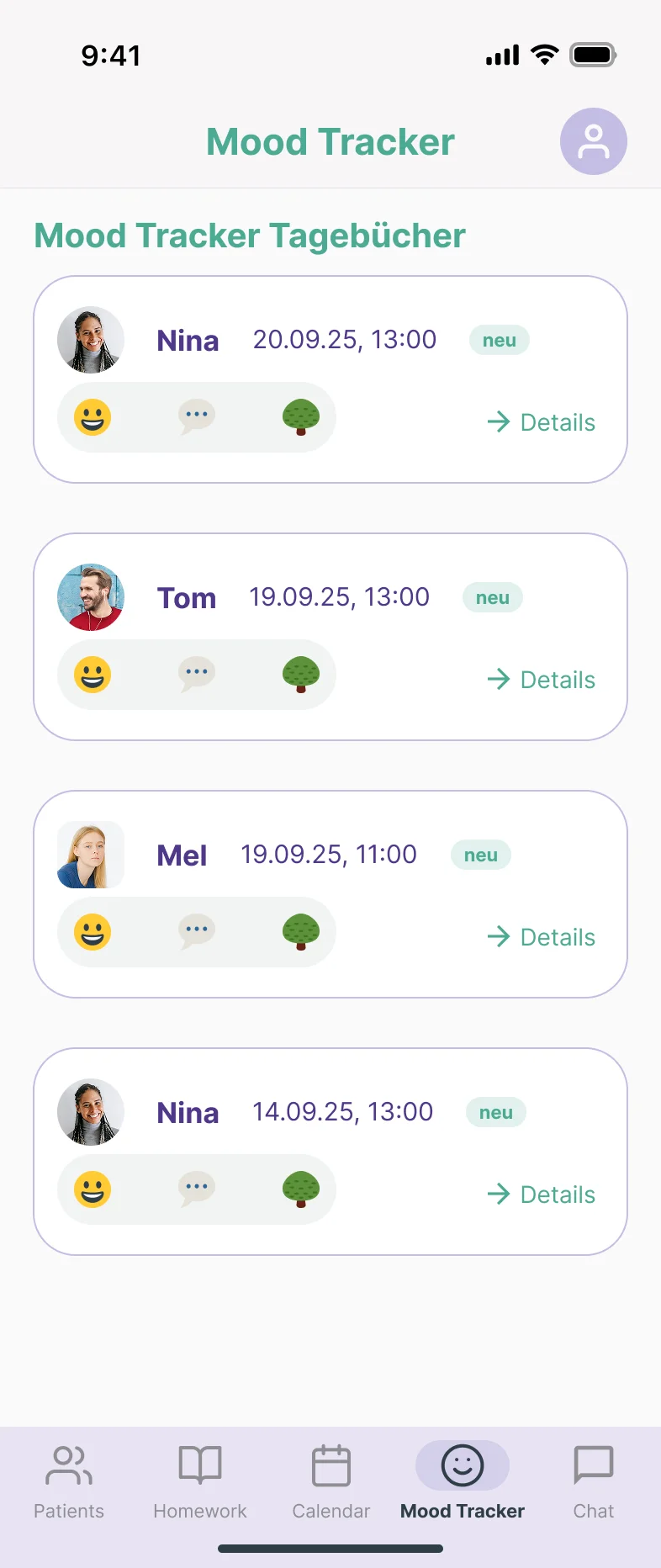
Figma designs for the mobile app: the patient dashboard, mood tracker and homework, then the therapist's patients, calendar and mood tracker overview.
The Final Product
By the end, Feelora was a complete, working product, not a prototype: the frontend was fully connected to the backend, and every flow from sign-up to booking worked end to end. What was missing wasn't on the product side. Before we could launch and test Feelora in a fully real-world setting, the platform needed GDPR and medical device (MDR) compliance checks and legal review, which we couldn't fund as a pre-seed team.
The frontend itself was a production-ready React app:
A single-page app with role-based routing: patients and therapists each get their own protected area, sharing one layout frame and one component library.
AWS Cognito for login, with tokens kept in HTTP-only cookies that JavaScript can't read, and a guard that checks both login and role on every protected route.
GraphQL through Apollo Client for data, and WebSockets for live chat messages and notifications.
Code grouped by feature (auth, patient, therapist, landing) on top of a shared core, with German and English throughout.
AI: Wrote boilerplate and helped with complex frontend logic.Me: Owned strategy and clinical UX decisions, and did the final review of all code.As the solo frontend developer, I used AI coding tools for boilerplate and complex logic, while strategy, clinical UX decisions and final code review stayed with me.
Outcome & What I Learned
We delivered a complete, working product: a landing page that drove 50+ pre-registrations, and a dual-sided web app that we tested with real therapists and patients and improved based on their feedback. The project is paused because a health platform needs full GDPR and MDR compliance checks before launch, and those legal costs were beyond our pre-seed budget.
- Learning #1
In health tech, compliance is part of the product
It needs to be scoped and budgeted from day one, just like features.
- Learning #2
Real users find what the scope cut
The patients tab and scheduling seemed optional on paper, but the pilot showed the product didn't deliver value without them.
- Learning #3
Trust drives adoption
From consent screens to license verification and emergency contacts, every step had to show users their data and wellbeing were taken seriously.
© 2026 Victoria Zeillinger · Impressum