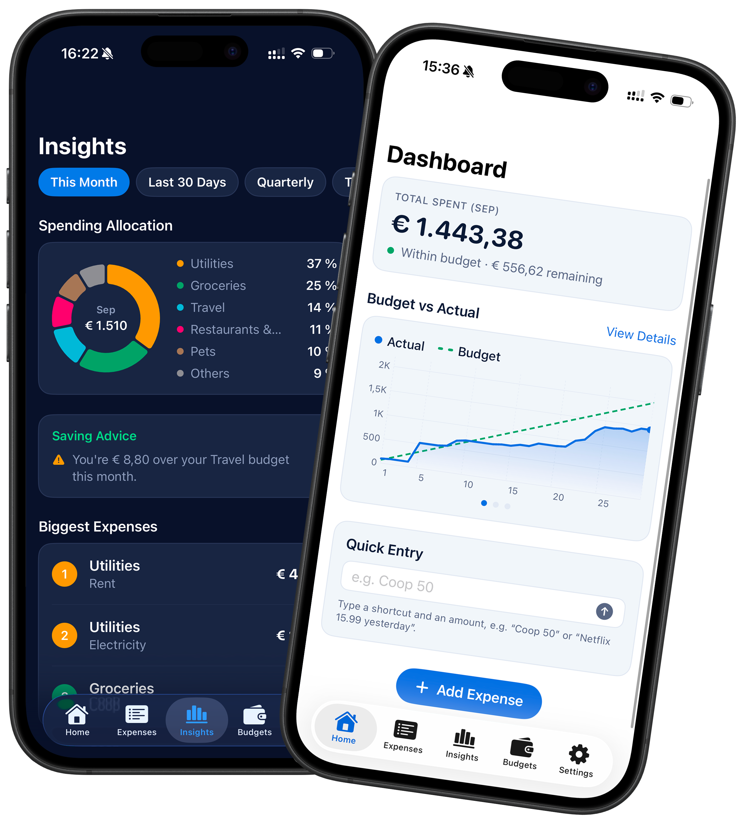
Birdget today: the beta in daily use, in dark and light mode.
Context & Scope
Birdget is a one-person client project: a native iOS expense tracker built around one specific person's needs. I own it end to end, from the first requirements meeting to the app running on the client's iPhone.
- Design: requirements, user flows and a clickable Figma prototype, followed by a redesign after the first feedback round.
- Development: the Swift app with Siri Shortcuts, light and dark mode; budget and category logic built together with an AI coding agent.
- Testing: installed directly from Xcode on the client's iPhone and refined in real daily use.
- Constraints: no backend and no AI categorization by design, all data stays on the device.
The Why: Every tracker got abandoned after a few days
A client asked me to design and build an expense tracker for them. They wanted to set a monthly budget, see where their money actually goes, and learn to handle it better. They had tried several apps from the App Store, but none covered everything they needed, and all of them failed at the same point: to log one expense they had to open the app, tap plus, type the amount, name it, pick a category and a date. After a few days they simply stopped.
The real problem wasn't missing features, it was friction. The client wanted to open the app to look at their finances, not every time they spent money.
The Brief & Concept: Log in a sentence, understand in a glance
- Budgets: a self-set monthly budget, plus separate budgets per category.
- Overview at a glance: a home screen graph of spending against the budget, and insights per category.
- Logging without opening the app: via Siri Shortcuts, as short as "50 Aldi", without choosing a category.
- Visual Direction: shades of blue, in a dark interface.
Logging without opening the app was the hardest part, so I proposed the rules before designing anything:
A Siri Shortcut and a Quick Entry field, both taking one line like "Coop 50".
Each category holds shortcut words. Add "Aldi" to Groceries once, and "Aldi 50" is filed there from then on. Predictable and fully under the client's control.
Quick entries are dated today, or yesterday if they say so. Older dates are edited in the list.
Amount, title, category and date, for when they want to enter everything by hand.
The client agreed right away: logging stays fast, and the data stays clean enough for a useful overview.
First Design: Clickable Figma Prototype
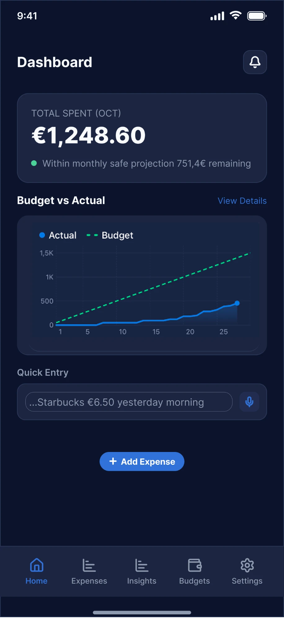
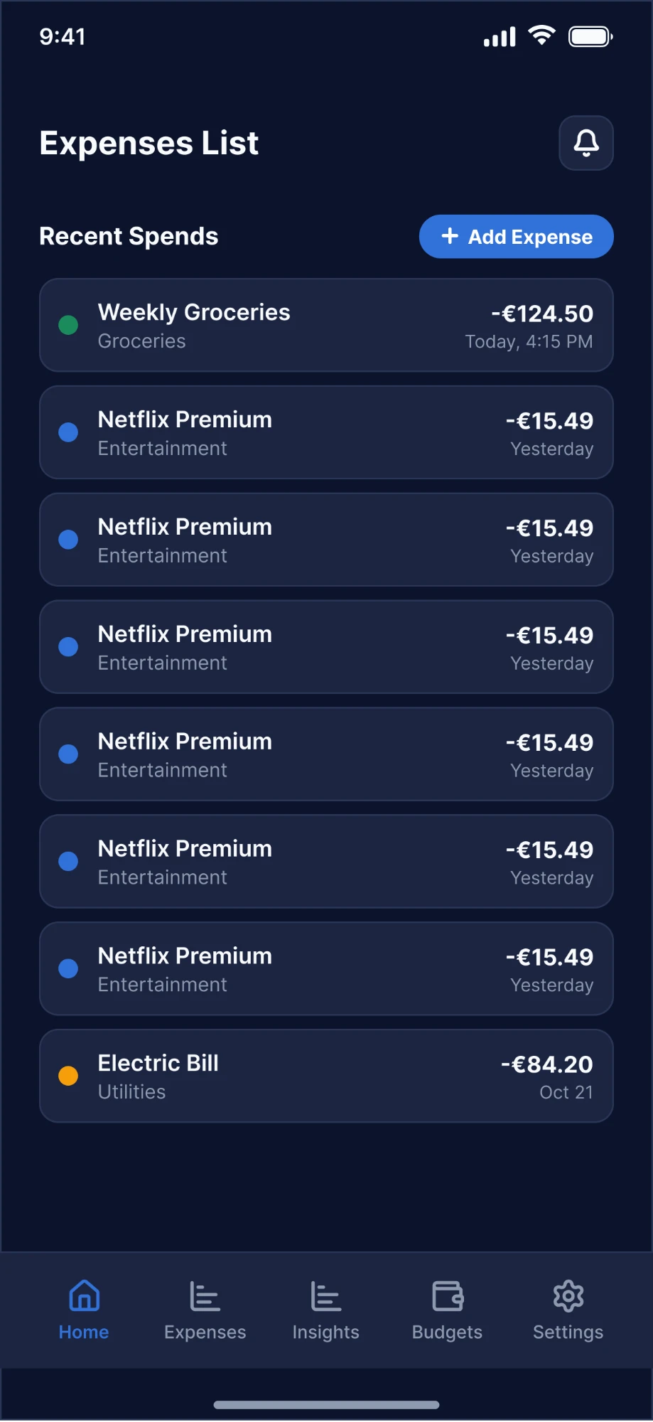
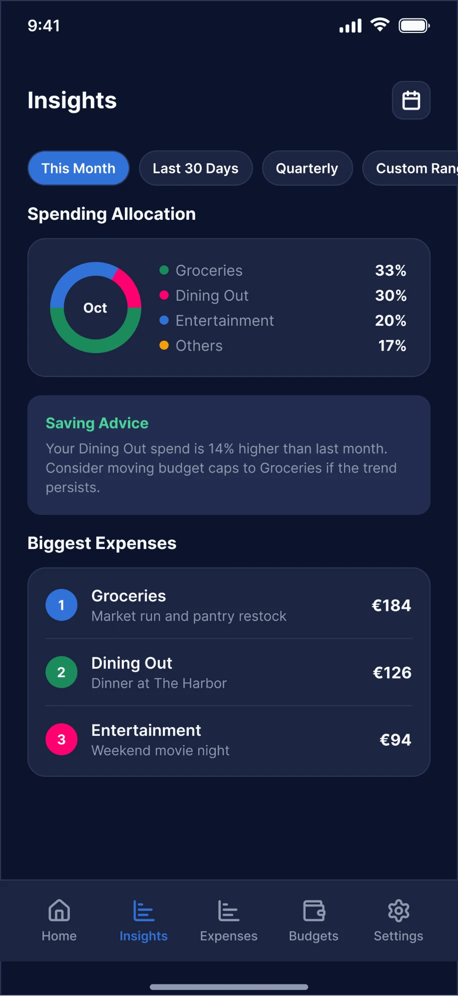
I designed the first draft in dark mode as a low-fidelity clickable prototype, focused on which screens connect and what lives where: a dashboard, the expense form, monthly and per-category budgets, insights, and category management with shortcut words.
One detail came straight from the client: the budget line in the dashboard graph rises linearly across the month, from zero to the full budget on the last day. It shows how much they should have spent by today to stay on track. As long as the actual spending line stays below it, they're on pace; if it crosses it, they're spending faster than their budget allows, even if the month isn't over yet. The idea is to stay within budget the whole month, not only notice at the end.
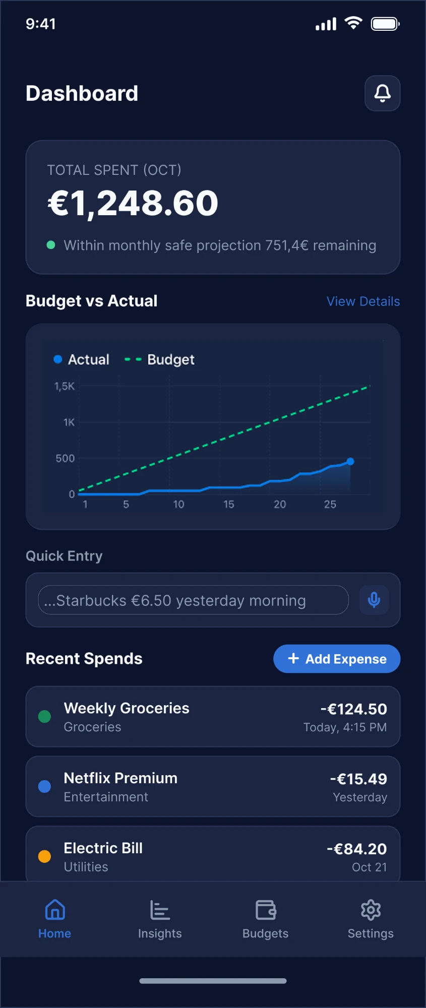
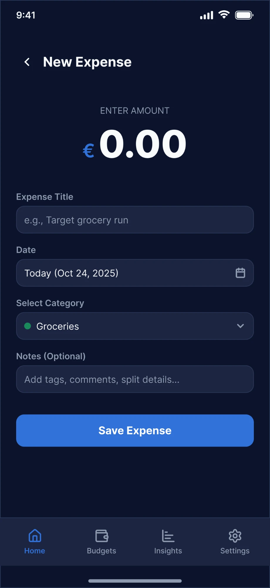
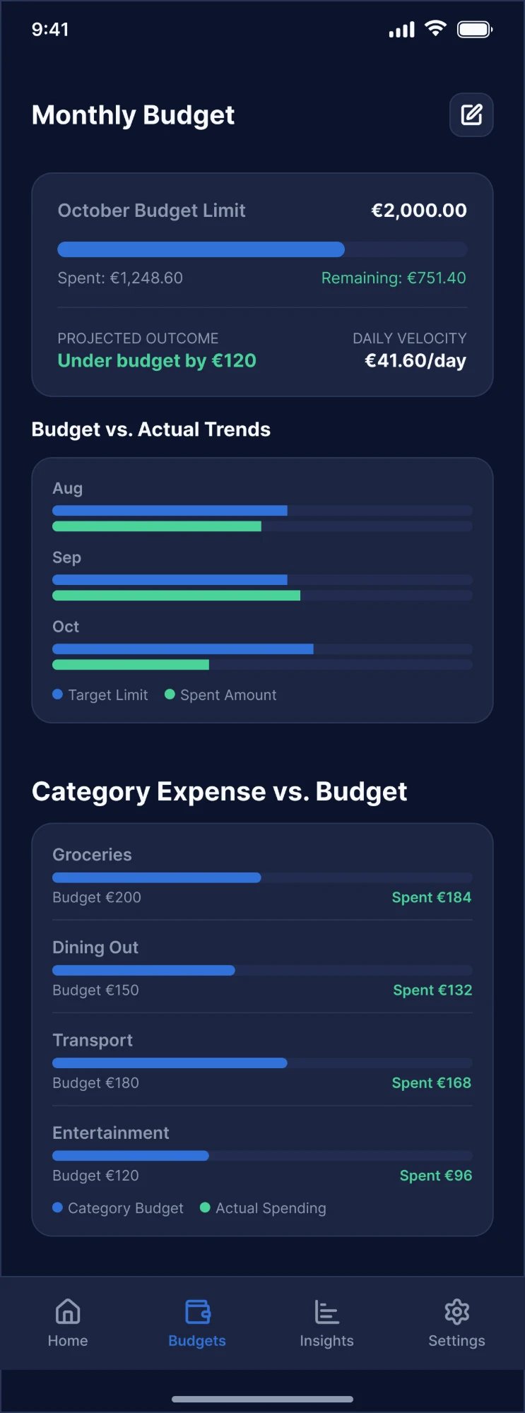
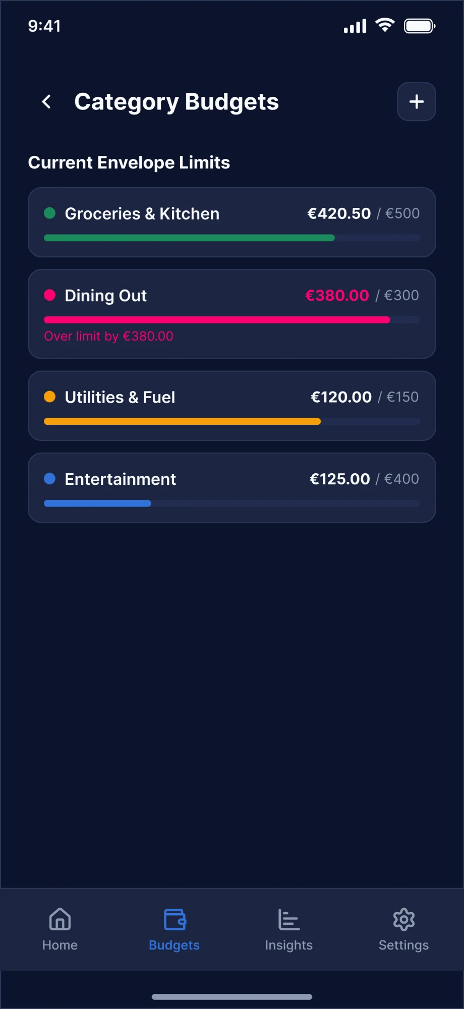
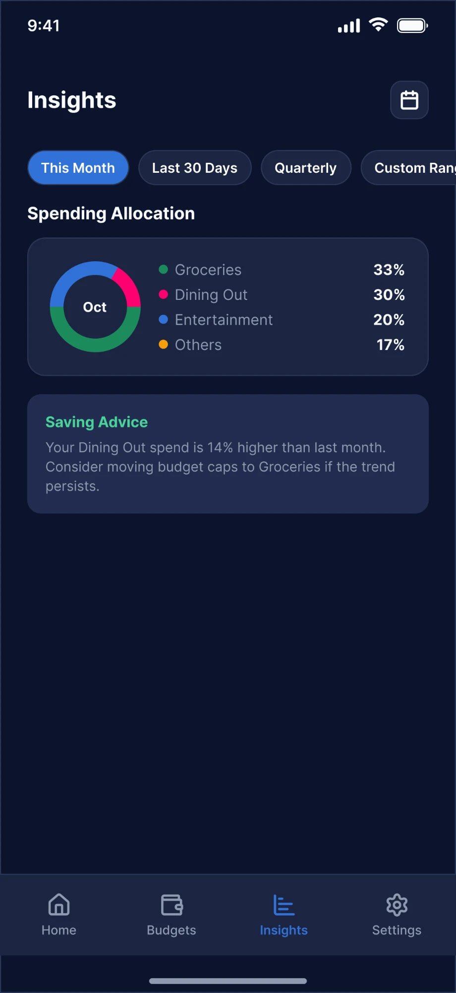
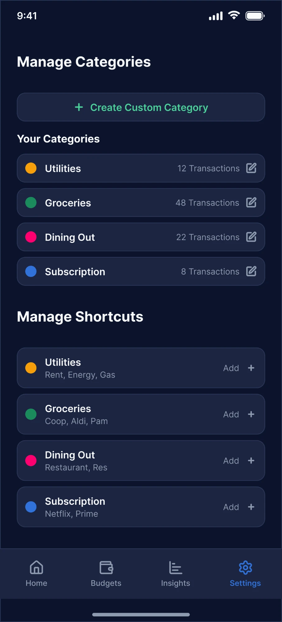
The first Figma draft: dashboard, expense form, monthly and category budgets, insights, and category shortcuts.
Feedback Round 1: Redesign Before Development
The feedback on the overall idea and look was very positive, with three changes:
- A home screen that felt packed: the client wanted the whole screen to scroll into the expense list with a sticky spending card. I explained that a long list would bury the overview, and proposed a separate Expenses tab instead. They were unsure it would add too much, but after the redesign they found it much more usable.
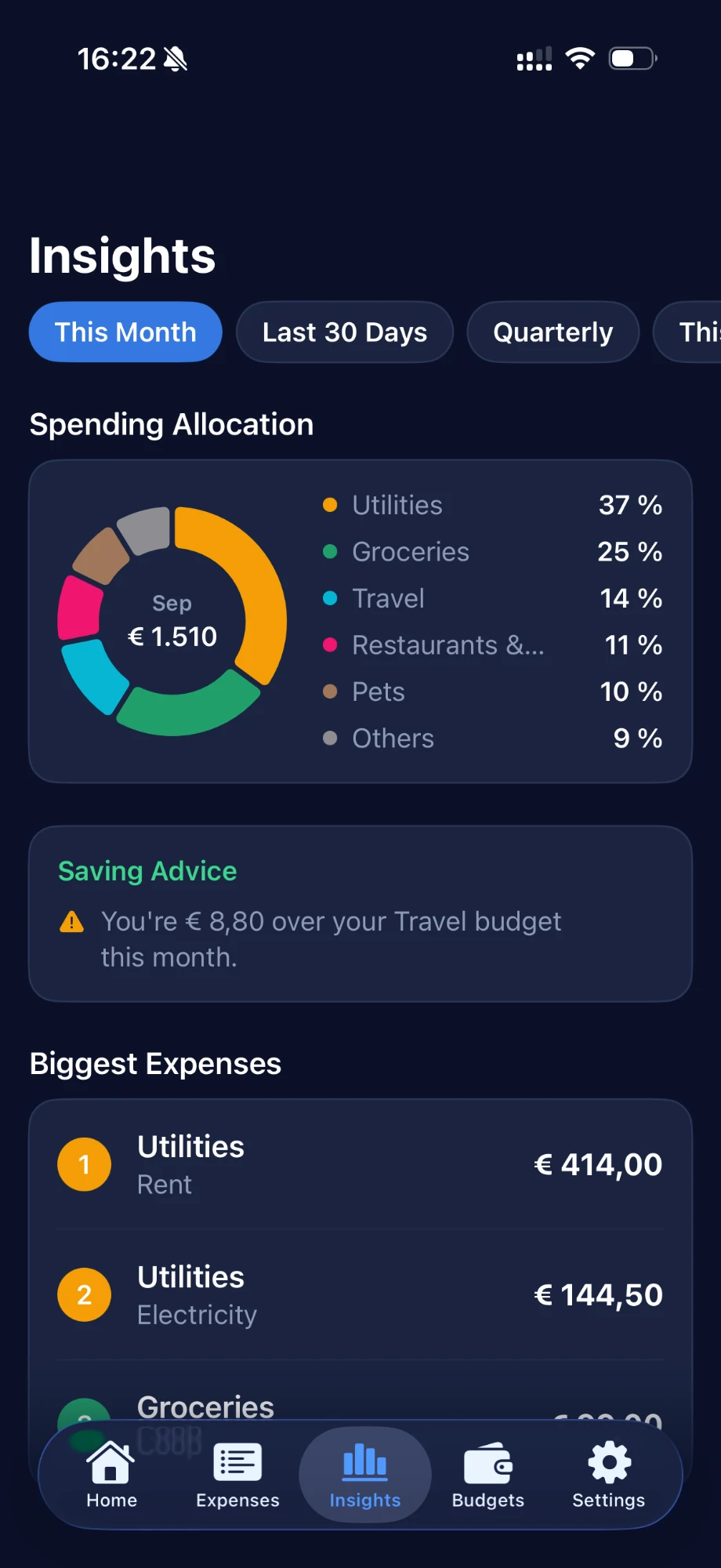
- Biggest expenses: Insights now shows the three largest expenses of the period, each with its category.
- Default categories: the client admitted that with an empty category list they might never set any up. So the app ships with sensible defaults they can rename, edit and extend.
Building the Beta in Swift
I built the app in Swift and Xcode and installed it directly on the client's iPhone for testing. Fast logging works in three places:
- Log Expense shortcut: one line with keyword and amount, e.g. "Aldi 67", categorized automatically through the keywords they set per category.
- Add Expense shortcut: the full entry, asking step by step for amount, category and date, still without opening the app.
- Quick Entry on the dashboard: the same one-line logic for when the app is already open.
Both shortcuts run from Siri ("Log an expense in Birdget"), the Shortcuts app, the Action Button or Back Tap, so they can pick whichever trigger fits their day. Shortcuts turned out to be the client's favorite part of the app.
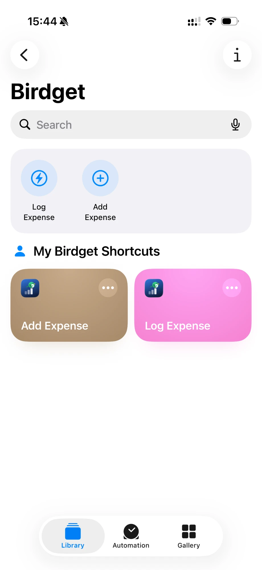
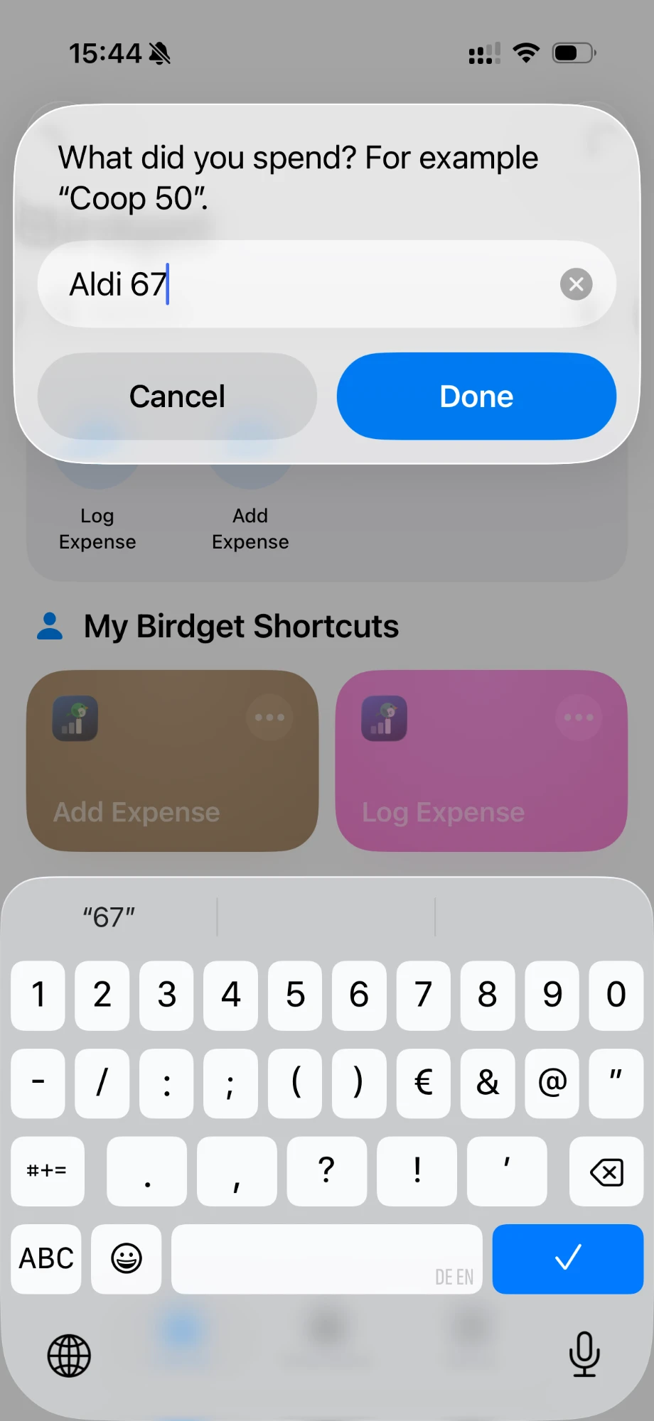
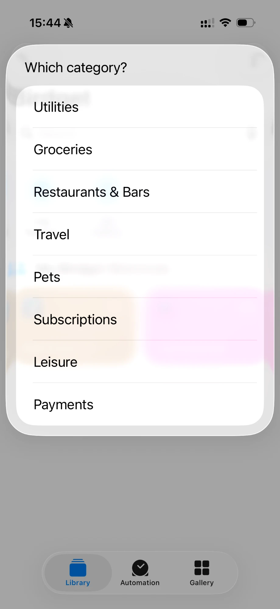
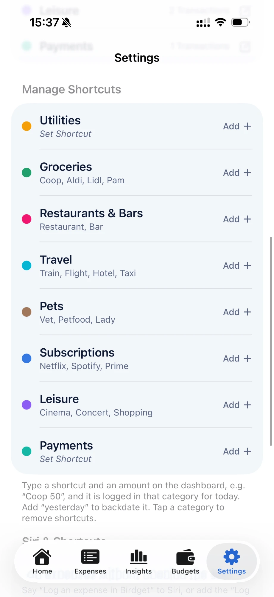
Birdget in the Shortcuts app, a one-line Log Expense, the step-by-step Add Expense, and the keyword setup behind the automatic categories.
AI: Turned my rules for budget pacing, category totals and keyword matching into Swift code.Me: Defined what every number means and how edge cases behave, then checked each version against test data.I'm a designer and frontend developer, not a backend engineer. For the app's logic and calculations, like budget pacing, category totals and keyword matching, I worked with an AI coding agent: I defined what the numbers had to mean and how edge cases should behave, and checked the results against test data before handing each version to the client.
Feedback Round 2: What Real Use Revealed
After a few days of real use we sat down again. Two points only surfaced once their actual spending was in the app:
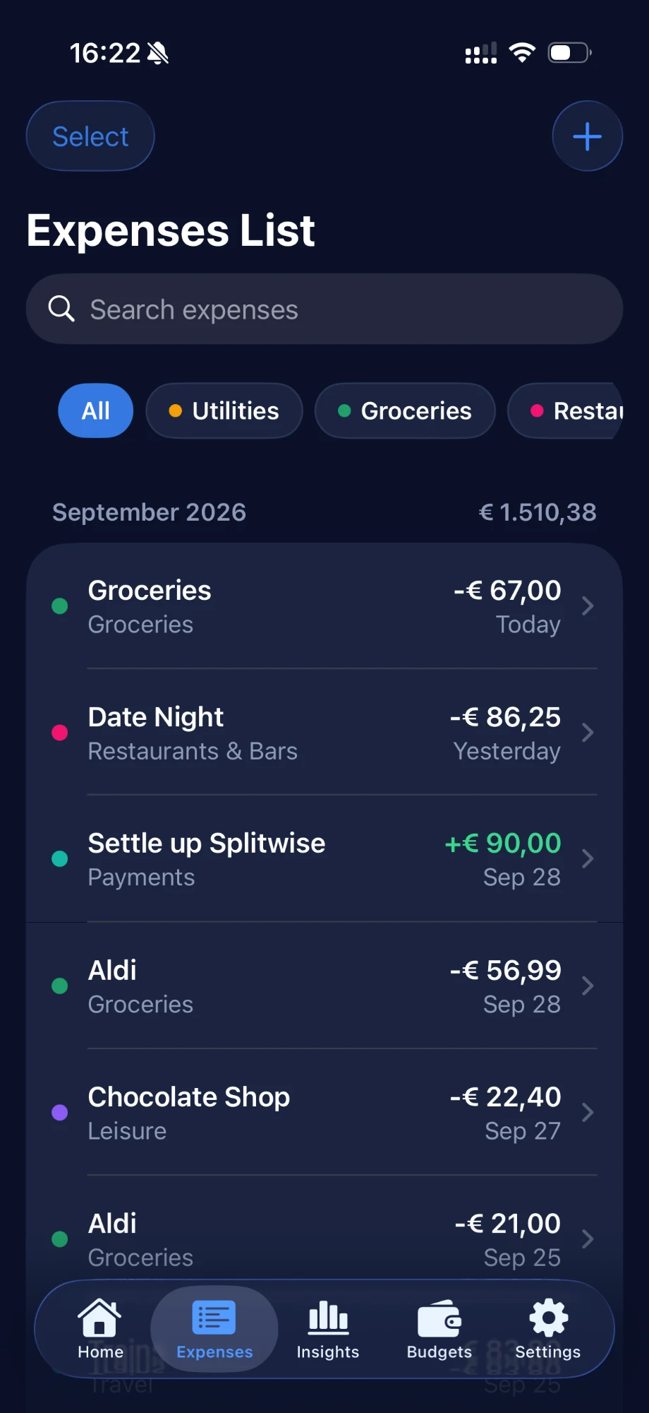
- A list they can work with: the expense list became searchable, can be filtered by category, and supports selecting multiple (or all) entries to delete at once. Before, they could only swipe to delete one at a time.
- Money coming back in: at the end of each month the client settles shared costs with their partner, so part of their spending gets paid back. The entry form now has an expense / income toggle, and all budget calculations account for incoming money.
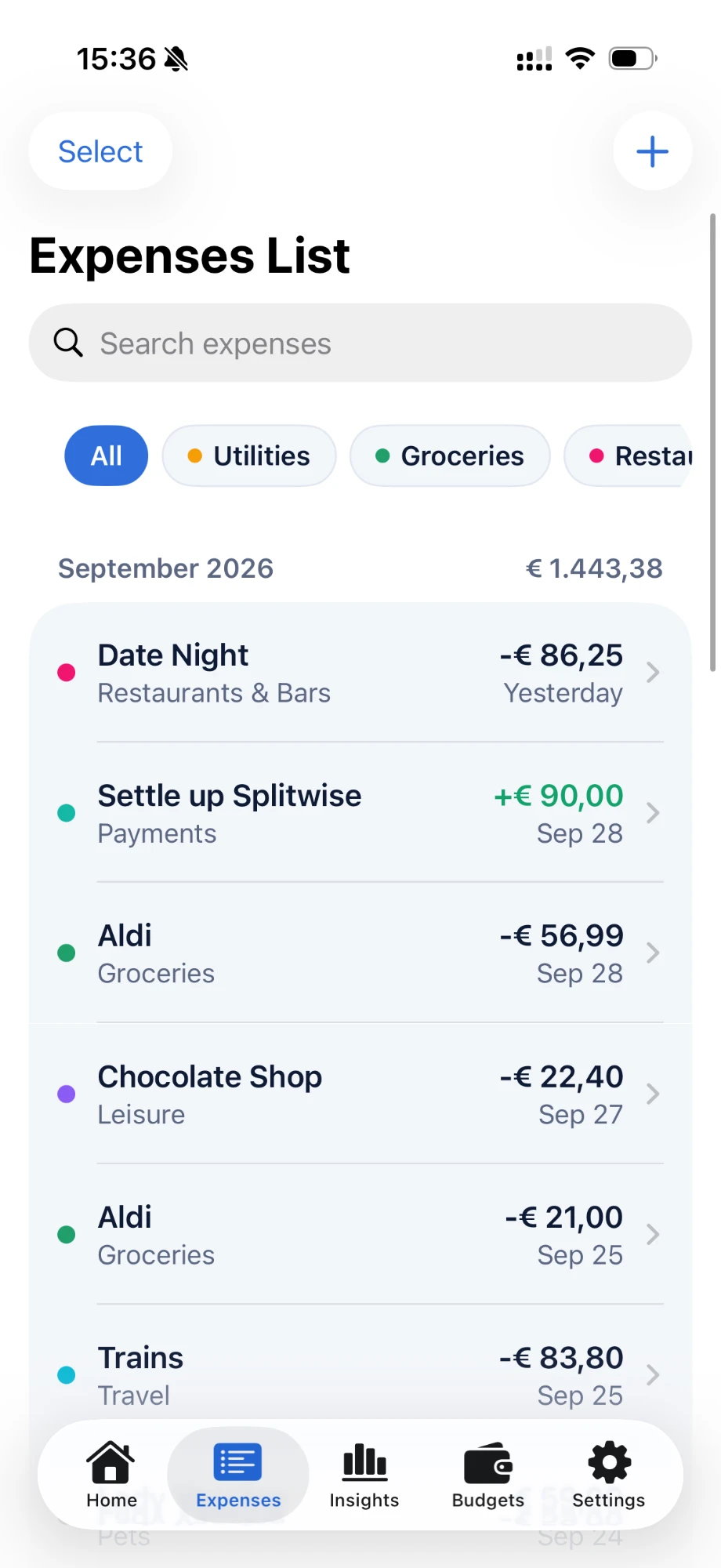
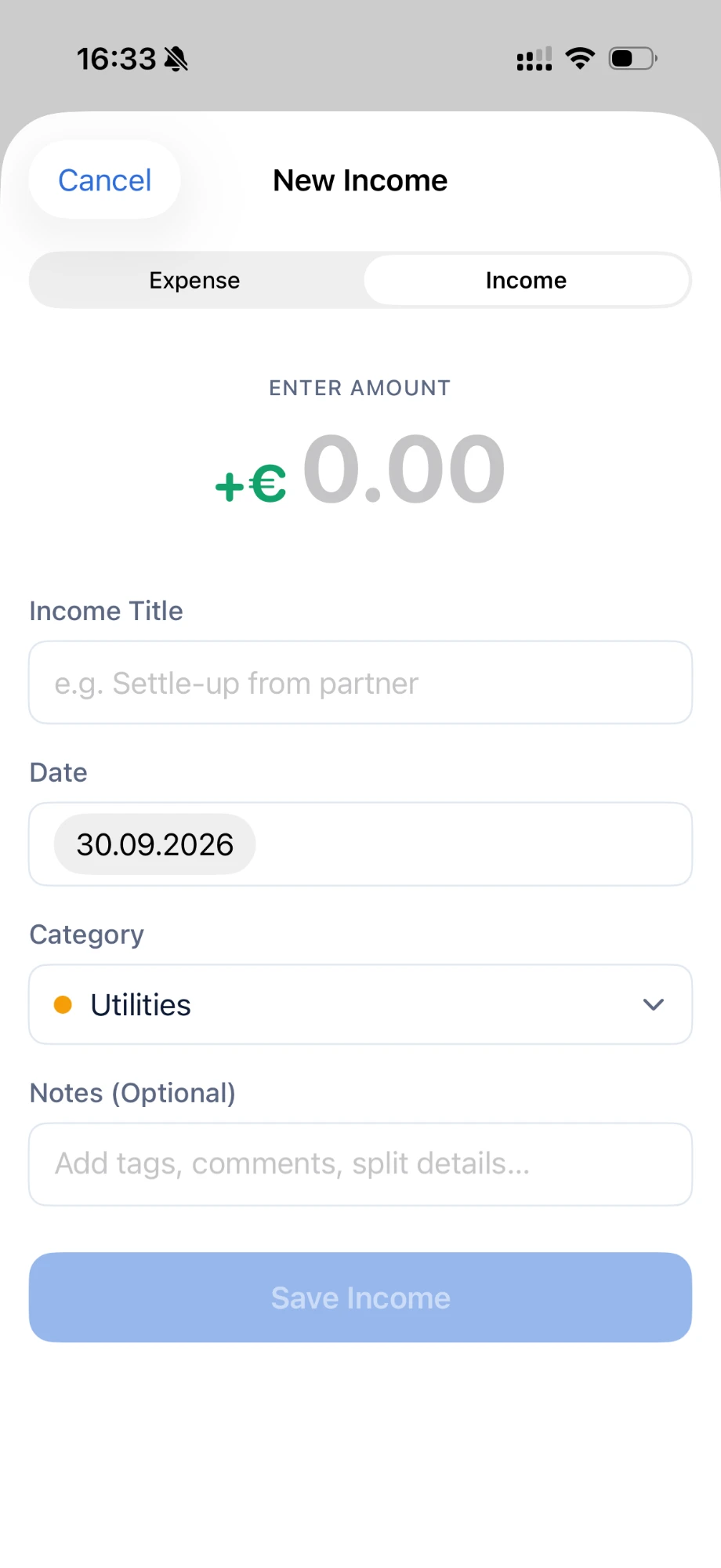
The expense list with search, category filters and multi-select, where a settle-up counts as income (+€90), and the entry form's expense / income switch.
One Graph, Two Mental Models
When I showed the app to a collegue who was looking for a similar tracker, the linear budget line didn't make sense to them at all. They read a budget as a cap: a horizontal line at the budget amount, with spending climbing toward it.
Both readings are valid, they just answer different questions. After discussing it with the client, I made the graph card swipeable with three views:
- Pace line: "Am I on track for today?" The client's original view.
- Budget cap: "How close am I to my limit?" The flat line the second tester expected.
- Progress ring: "Is my spending ahead of the calendar?" It compares how much of the budget is used with how much of the month has passed.
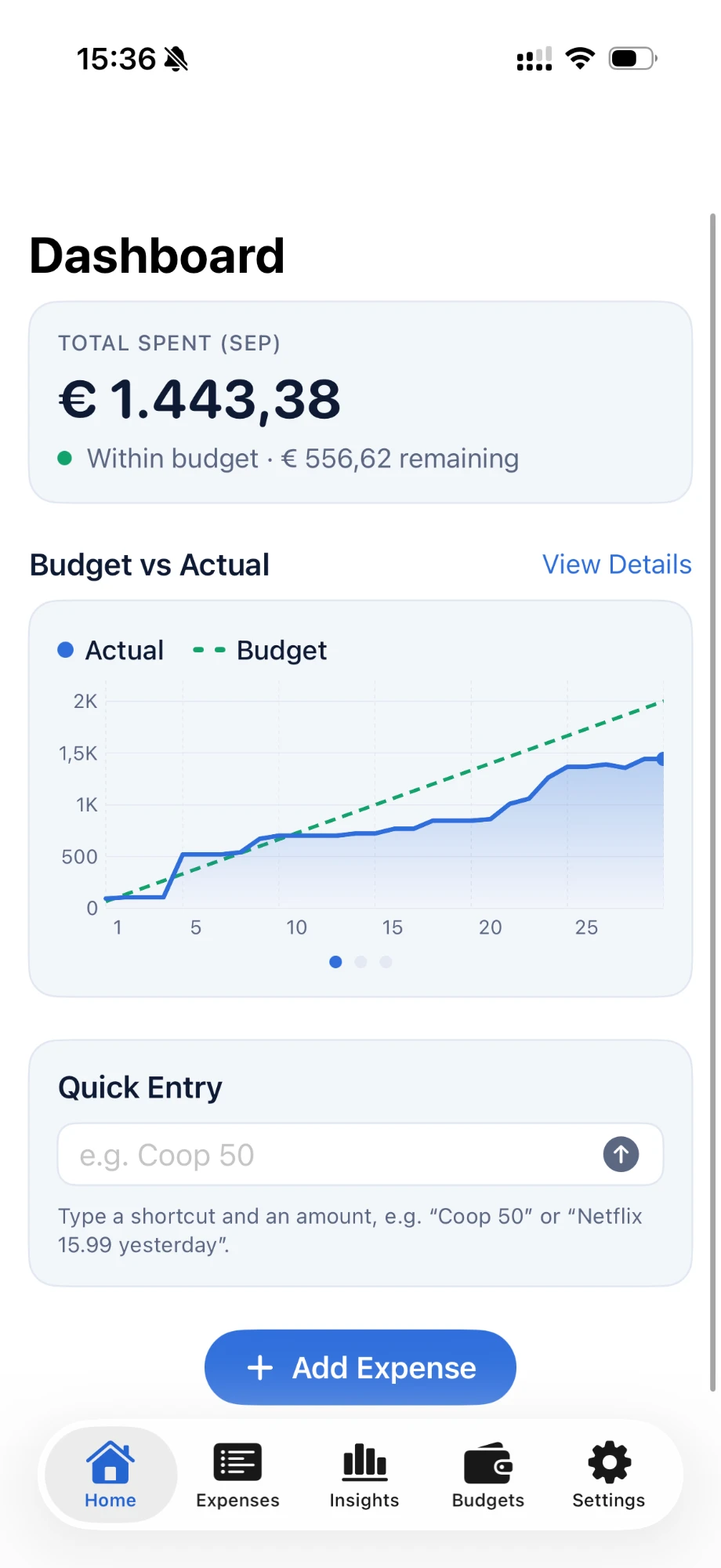
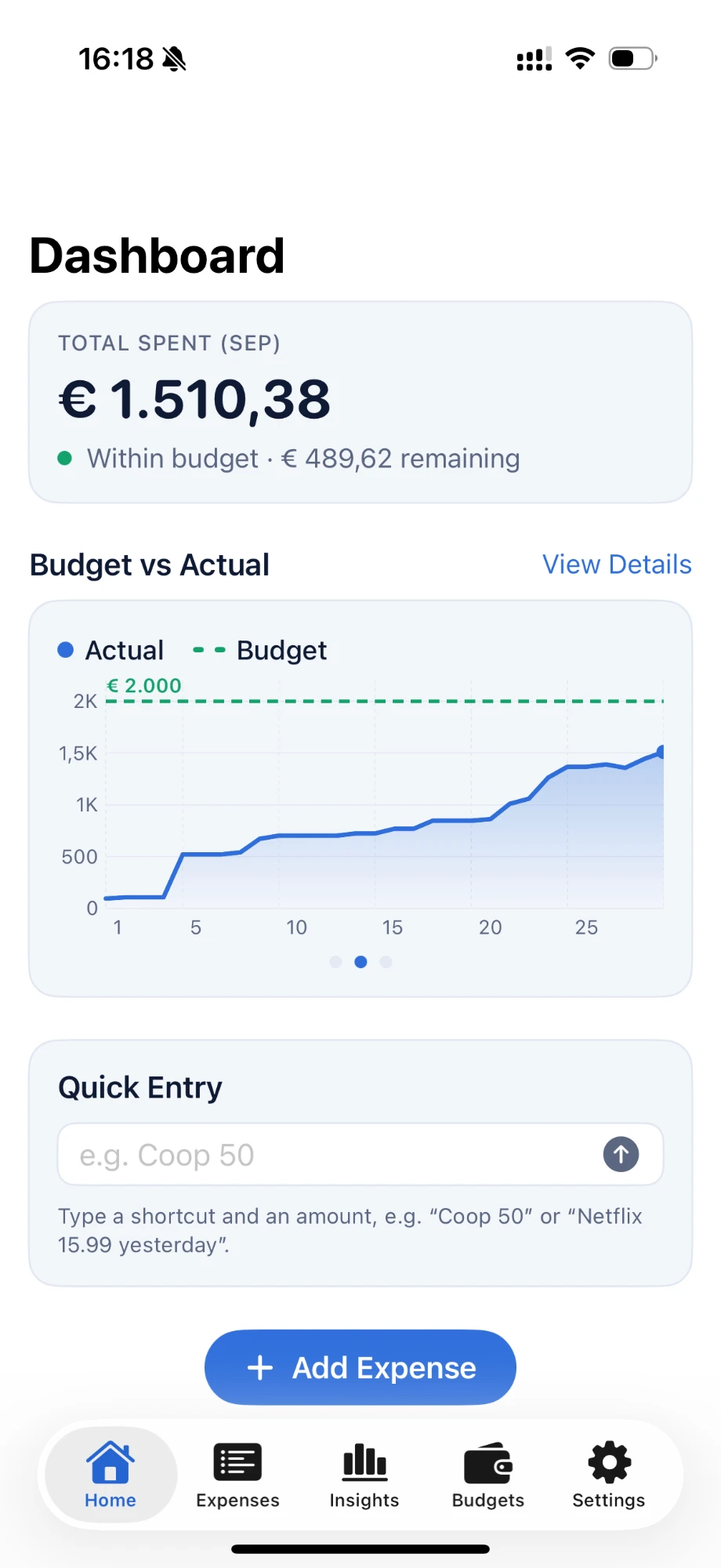
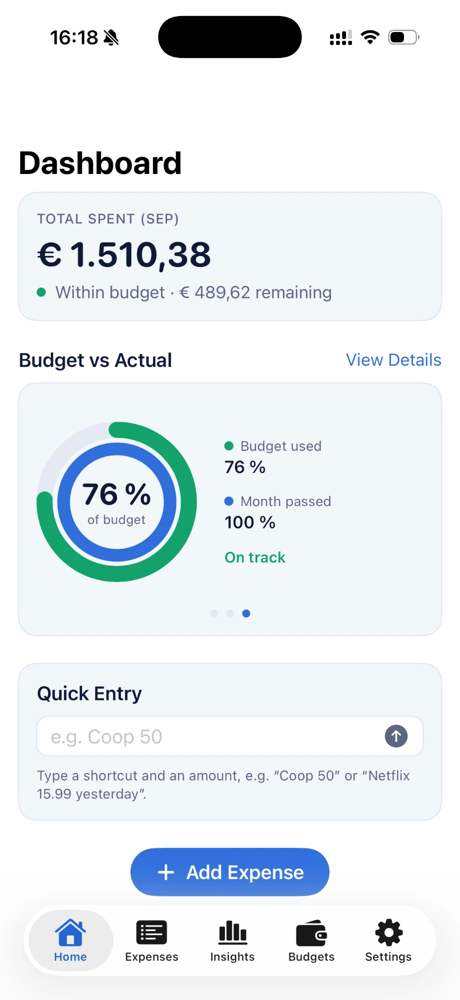
One swipeable card, three ways of reading the same budget: pace line, budget cap and progress ring.
Catching Overspending Early
The point of the app isn't to record spending, it's to change it. So Birdget flags problems while there's still time to react: the monthly view projects where the month will end based on their daily spending rate, category budgets turn orange when they get close to the limit and red once they're over, and Insights calls out every category that went over.
Once the overall budget is exceeded, the whole app switches to red: the status on the dashboard, the spending line in the graph, and the monthly budget with its projected outcome. There's no way to miss it, even with a quick glance.
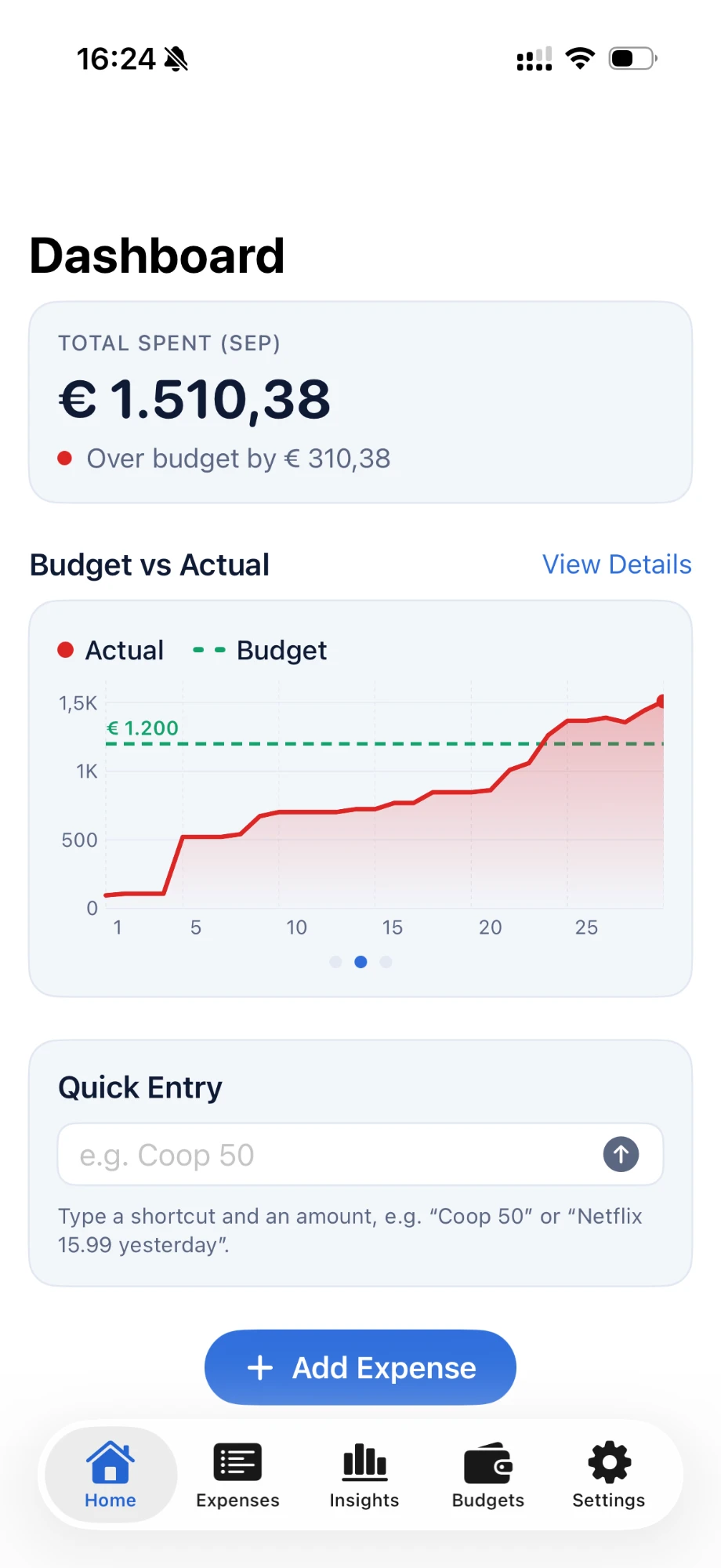
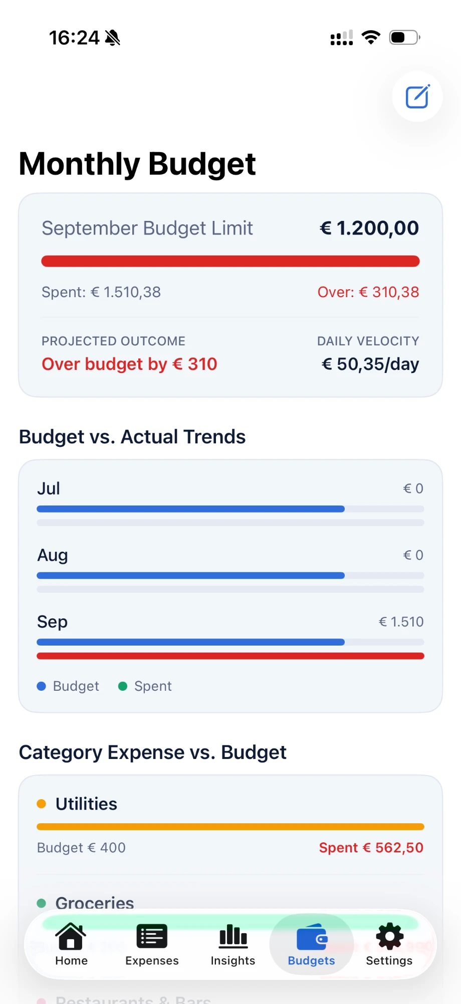
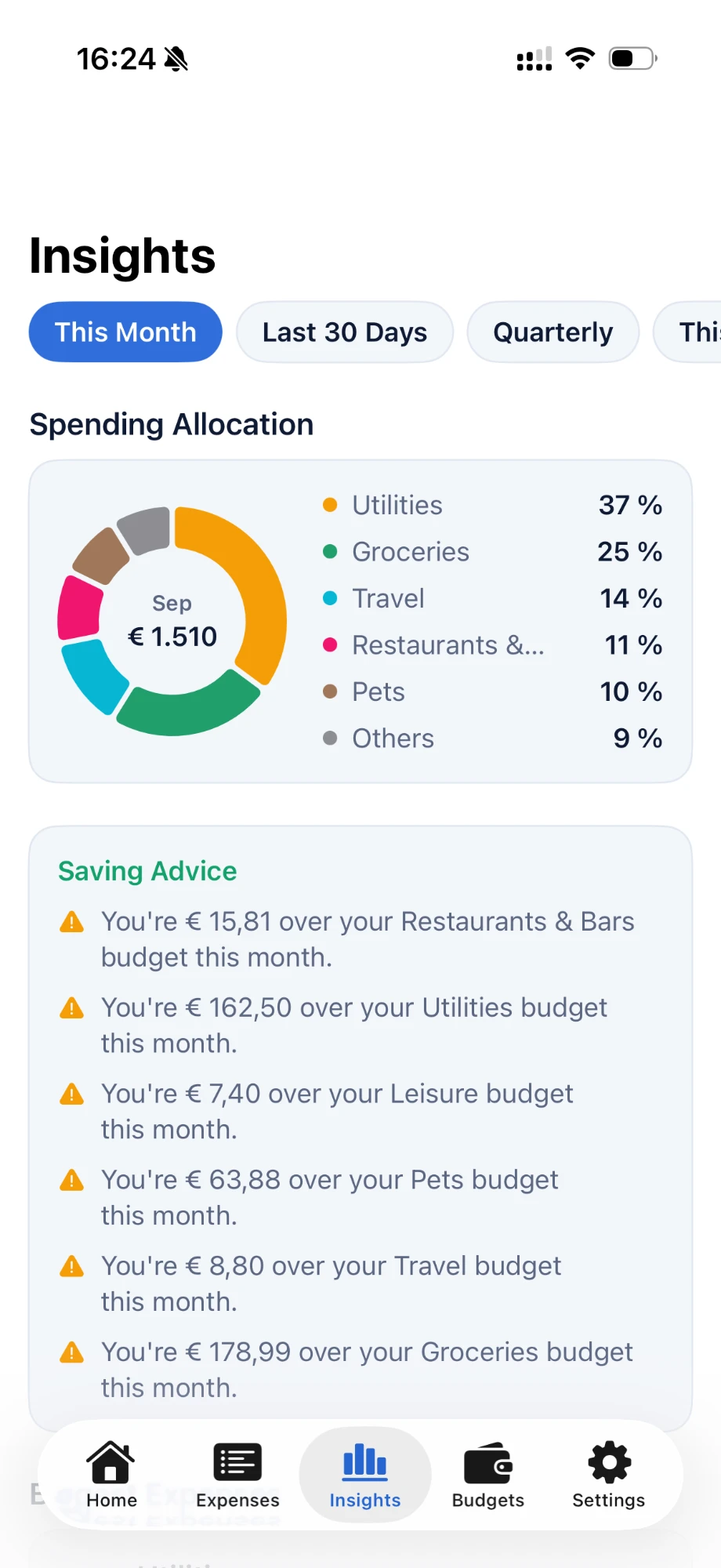
Over budget on the dashboard and in the monthly view, and saving advice in Insights for every category over its budget.
Designed Dark, Lived in Light
The client asked for a dark interface, so the Figma design was done dark-first. Once they used the real app every day, they preferred light mode. The app now follows the system setting or can be set to light or dark in Settings, and the app screenshots on this page show light mode, the way it's actually used. The dark theme stays close to the original Figma design.
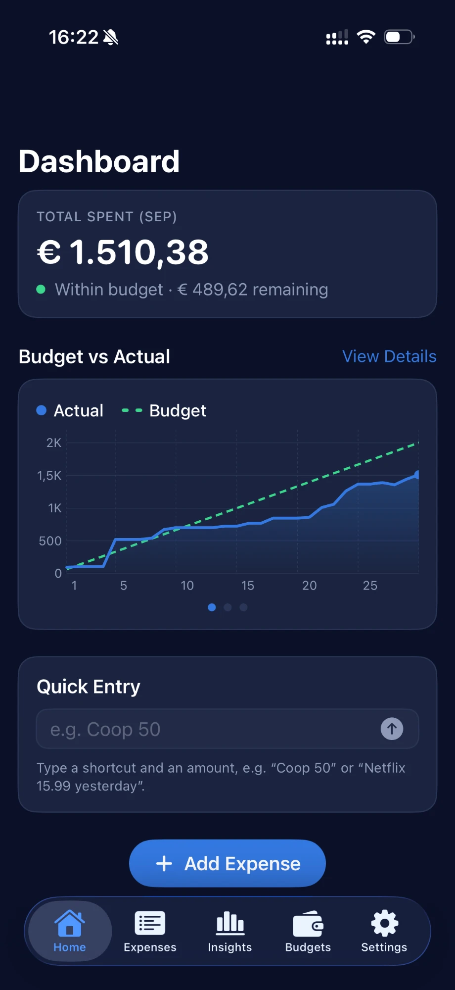
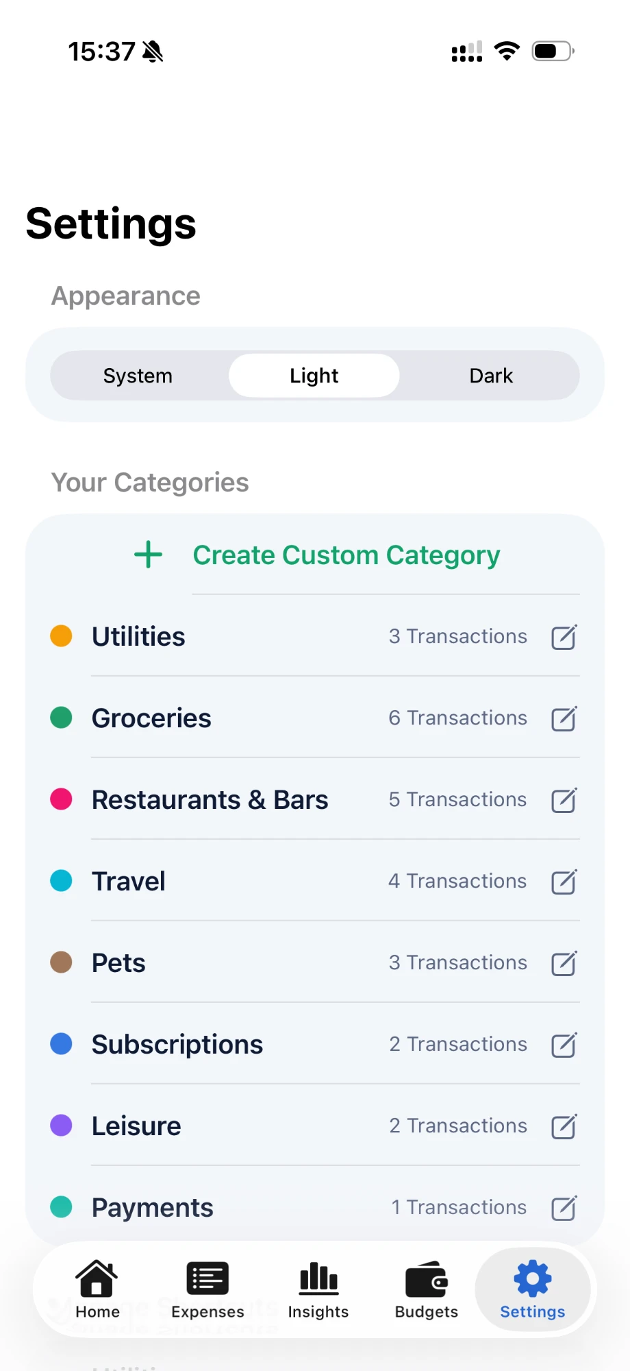
Appearance setting: System, Light or Dark.
Current Status: In Daily Use Since September 2026
Birdget is in its second testing phase. Since September 2026 the client has used it daily as their only expense tracker and collects feedback as it comes up; critical bugs are fixed right away. At the end of this round we go through everything together and decide on the next iteration. Once it runs smoothly, the goal is an App Store release, so others with the same problem can use it too.
What I Learned
- Learning #1
Simple beats feature-rich
Features and nice add-ons can look valuable on paper, but every extra step is friction. If logging takes effort, people stop using the app, so sometimes the simpler version is the better one.
- Learning #2
Designing for one person shifts the focus
Instead of balancing the needs of a user group, every decision followed one real person’s habits and preferences. That needs a different focus than designing from personas.
- Learning #3
Offer more than one look
A style that works well in one app doesn’t automatically work in another: the client asked for dark mode but lived in light mode. Showing several versions early keeps the client open instead of putting them off.
Privacy Policy
Birdget stores all data locally on your device. No personal information is collected, transmitted, or shared. The app does not use third-party analytics or advertising. If cloud synchronization is added in a future update, this policy will be updated.
© 2026 Victoria Zeillinger · Impressum